Neel owned the audit, visual language, information architecture, foundations, component patterns, interaction rules, reference surfaces, and quality bar.
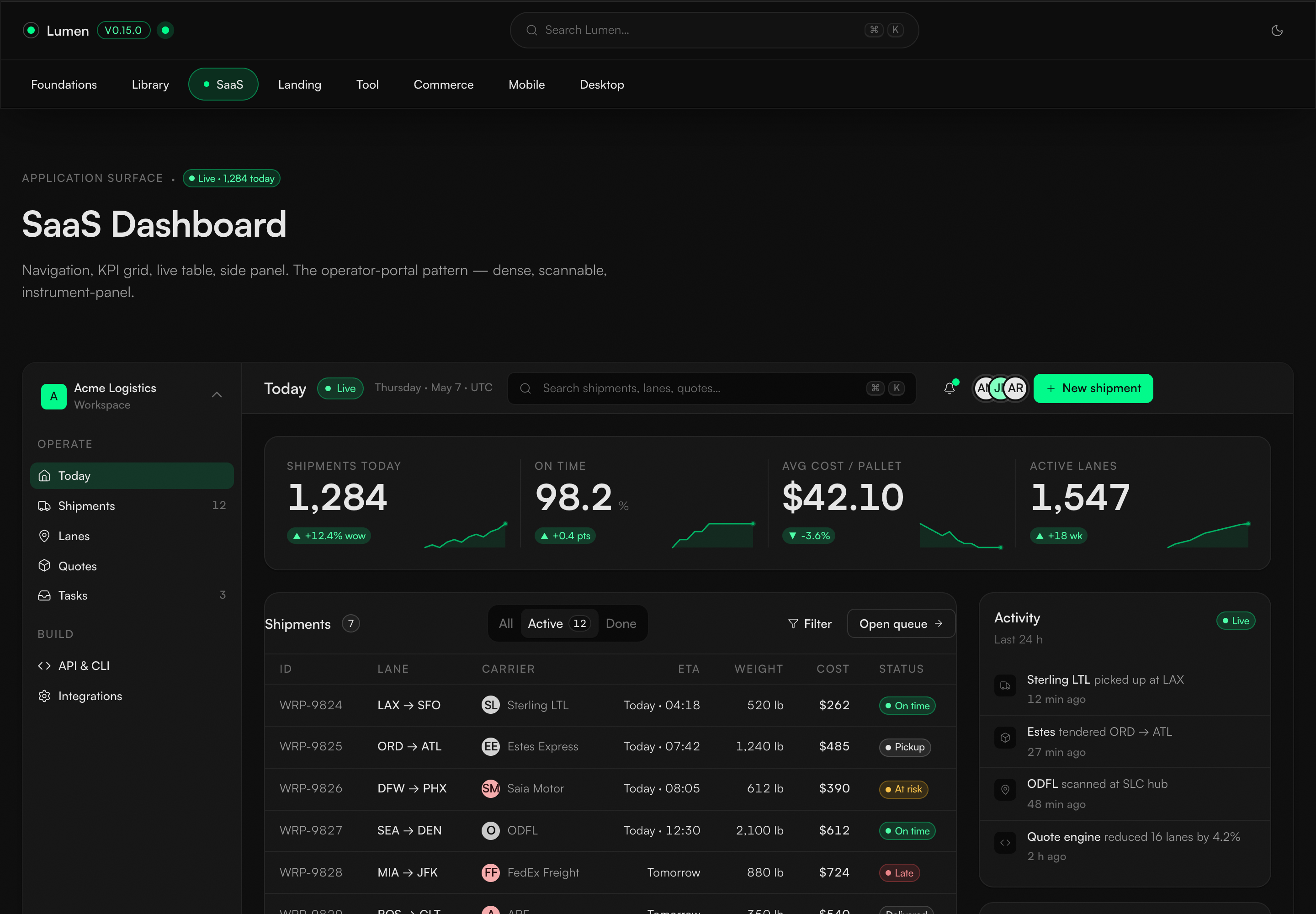
IMAGE UNAVAILABLECurrent SaaS reference combining operator navigation, KPIs, work queue, and live activity.
IMAGE UNAVAILABLECurrent Foundations page showing the system's palette, type, status, and navigation contract.
IMAGE UNAVAILABLECurrent iOS and Android reference surfaces shown side by side.
CASE 02Design system across surfaces
Lumen: One visual language for Warp
Warp's product, marketing, and internal tool surfaces had evolved into three visual systems, including three different brand greens in one transactional flow. Neel designed Lumen to reconnect them through a shared visual language, clear component anatomy, consistent state behavior, and reference screens that show how the system adapts without making every product look identical.
Warp's existing green and the density required by freight operators were starting points. Neel shaped them into a coherent hierarchy, disciplined use of one accent, and reusable interaction patterns.
The system keeps shared roles for color, type, spacing, state, and motion while letting product, marketing, commerce, mobile, and desktop retain the behavior their context requires.
Fragmentation came from missing shared decisions
Three systems and three greens on one transactional surface showed that restyling alone would not prevent the next inconsistency.
Teams could find individual colors and components, but not one clear answer for hierarchy, state, density, or platform behavior. Old guidance and new screens diverged, so each surface filled the gaps differently and visual drift multiplied.
- Designers and engineers maintaining product, marketing, and internal tools.
- Product teams moving between dense operational tasks and focused customer journeys.
- End users who should experience one coherent freight product across different surfaces.
- Dense operator interfaces still needed clear hierarchy and restrained emphasis.
- Mobile and desktop had to share a visual language without copying the same navigation shell.
- Written guidance and rendered examples had to teach the same rule.
- A lean team needed patterns that stayed understandable without relying on memory.
The same missing state, unclear hierarchy, or retired visual rule could affect many surfaces. The durable intervention was a shared design model, not another isolated cleanup.
The audit mapped where consistency was breaking
The inventory connected visual drift, component coverage, behavior across platforms, and accessibility into one design problem.
One transactional flow revealed three visual systems and three competing versions of the brand accent.
Product, marketing, and internal tools.Lumen defines the anatomy, states, and intended use of 98 interface patterns.
Reference coverage across multiple surface types.One token source compiles into ten output formats intended for nine platform targets.
Formats and targets are distinct counts. This does not claim complete native component parity across nine platforms.Focused examples test the language across foundations, operations, tools, commerce, marketing, mobile, desktop, and the component library.
Different densities, one shared hierarchy.Separate reviews examined interaction, mobile behavior, components, guidance, retired colors, and contrast.
Each round targeted a distinct design risk.Poor contrast between pale text and green backgrounds across eleven or more pages prompted a new semantic text role and a usage rule applied across the system.
A specific contrast repair, not blanket certification.01 / Foundations signal
One constrained visual language
A neutral Obsidian canvas carries hierarchy, Satoshi handles text and tabular numerals, and Spring Green is reserved for action, live, or success. The green belonged to Warp already; making one loud color mean one thing, and enforcing that boundary, was Neel's design decision.
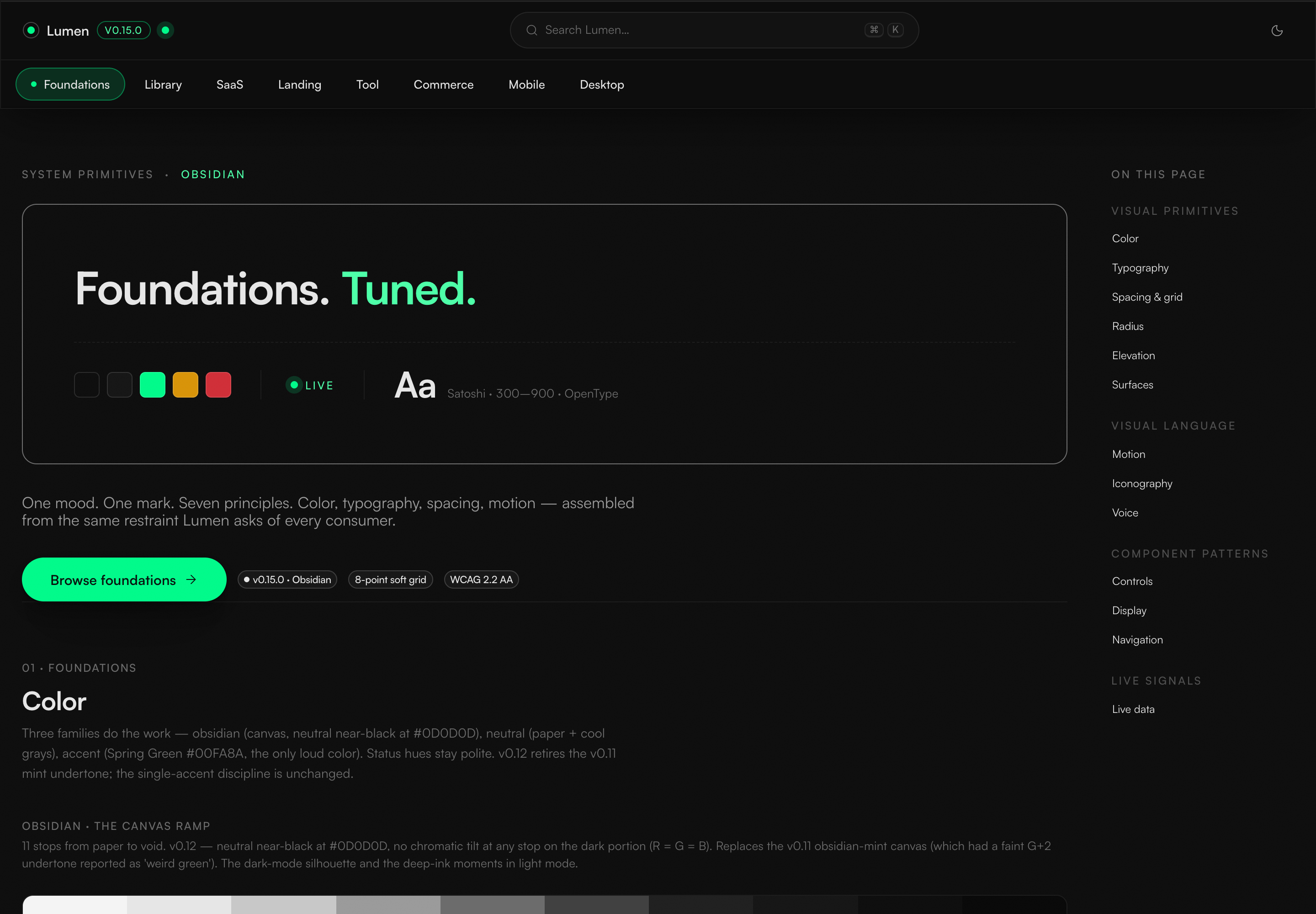
IMAGE UNAVAILABLECurrent Foundations page showing the system's palette, type, status, and navigation contract.
Foundations signal
The current Foundations page brings palette, typography, status, navigation, and versioning into one inspectable surface.
Semantic roles replaced taste and memory
A shared vocabulary gives every surface the same answer for hierarchy, state, emphasis, and behavior.
Where should teams look when a visual rule is unclear?
Keep foundations, component anatomy, examples, and rationale together.
The system should answer both what a pattern looks like and why it behaves that way.
REJECTED PATH Scatter visual rules across isolated files, screens, and team memory.
How should the system balance clarity with the information density freight operators need?
Use restrained behavior and hierarchy without removing valuable operational detail.
Clarity comes from structure, spacing, and emphasis, not from making every working surface sparse.
REJECTED PATH Flatten the system into generic minimalism or preserve inconsistent terminal styling.
How should components use color, type, and spacing?
Choose semantic roles based on purpose, never isolated visual values.
A role such as action, live, success, or supporting text can stay consistent even when the palette evolves.
REJECTED PATH Let each component choose visual values independently.
Can the existing brand accent appear in elevation effects?
Retire green from every shadow and reserve Spring Green for action, live, or success.
Reviewing the effect in context showed that colored light reduced clarity, so the glow was removed across the reference surfaces.
REJECTED PATH Protect an internally consistent green halo after the rendered product showed it was distracting.
How should guidance stay aligned with the rendered interface?
Review written guidance and visual examples together whenever a rule changes.
A correct interface can still drift later if its guidance continues teaching an obsolete pattern.
REJECTED PATH Assume guidance updates itself when the visual system changes.
Eight reference screens test the language in context
Foundations, operations, focused tools, commerce, marketing, mobile, desktop, and the component library show how the system behaves at different densities.
01 / Operator references
Dense dashboards and focused task flows
Wide and compact operational views sit beside a focused quote creation tool. Tabular numerals, clear live status signals, and restrained motion support scanning without turning density into visual noise.
IMAGE UNAVAILABLECurrent SaaS reference combining operator navigation, KPIs, work queue, and live activity.
Operator reference
The SaaS reference demonstrates dense scan paths without losing hierarchy or action priority.
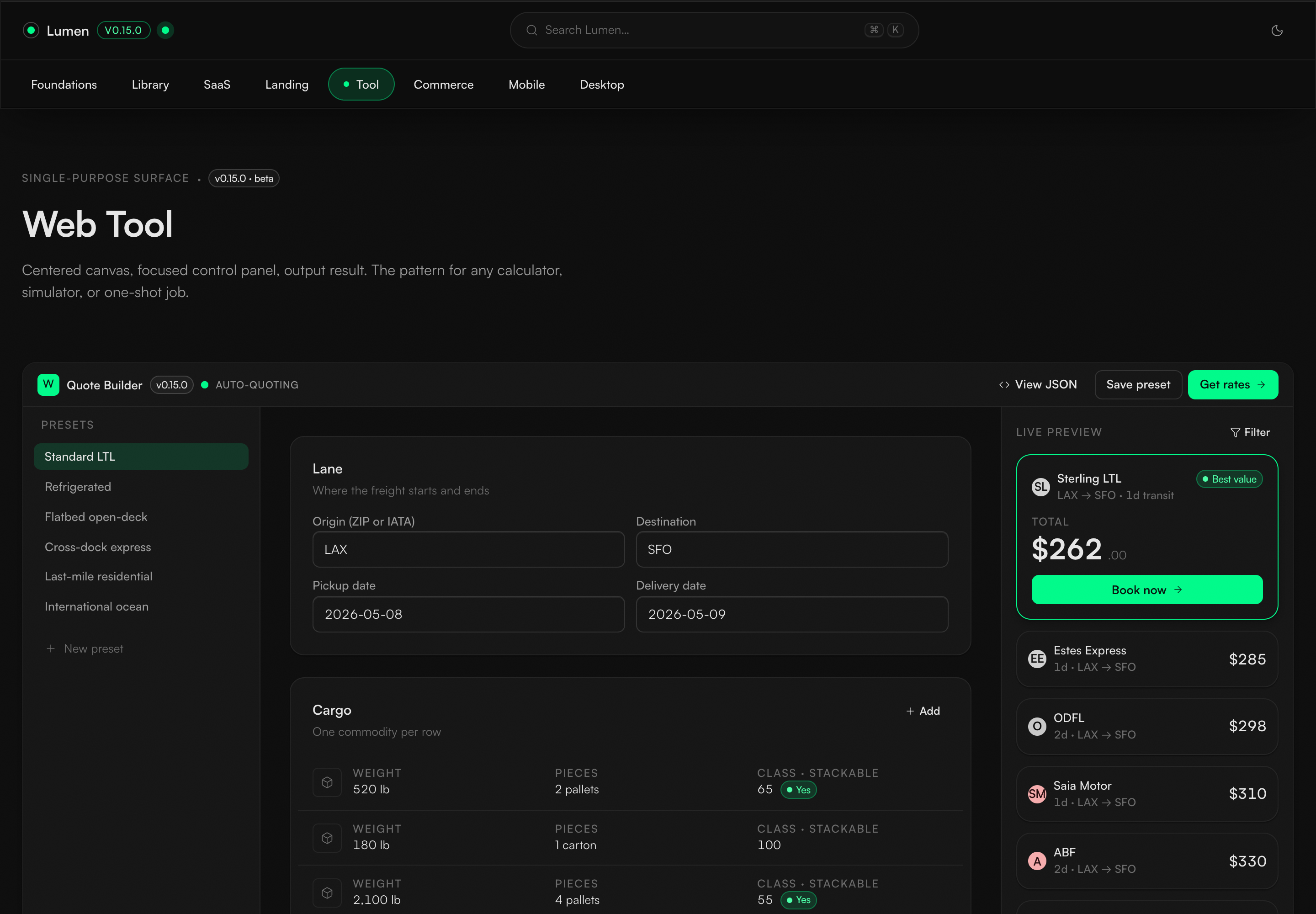
IMAGE UNAVAILABLECurrent focused tool reference with input, live preview, and output hierarchy.
Focused tool reference
The focused tool reference narrows the same system to a single quote creation task and live result stack.
02 / References across platforms
Shared visual roles, behavior specific to each platform
The iOS, Android, macOS, and Windows references retain familiar navigation and window conventions while sharing status hierarchy, emphasis, and density rules.
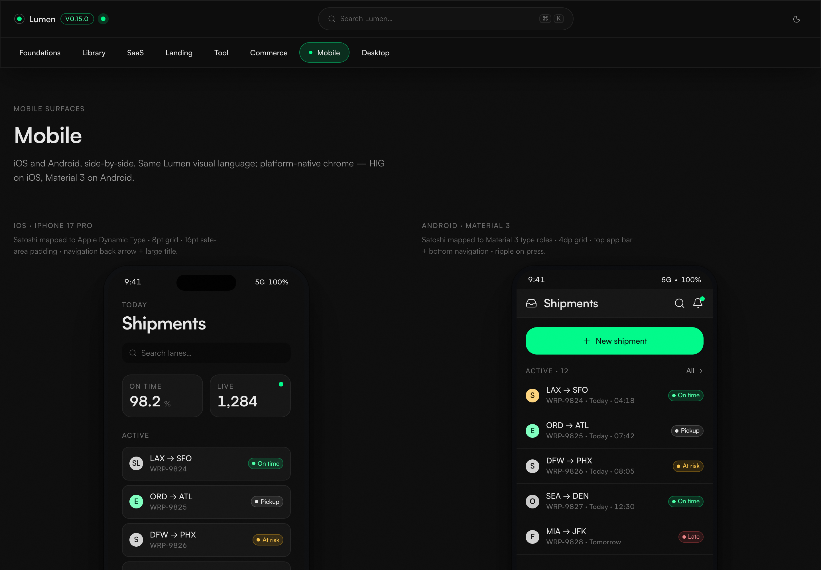
IMAGE UNAVAILABLECurrent iOS and Android reference surfaces shown side by side.
Mobile references
Shared tokens map into navigation native to each platform and information density instead of forcing one shell onto both systems.
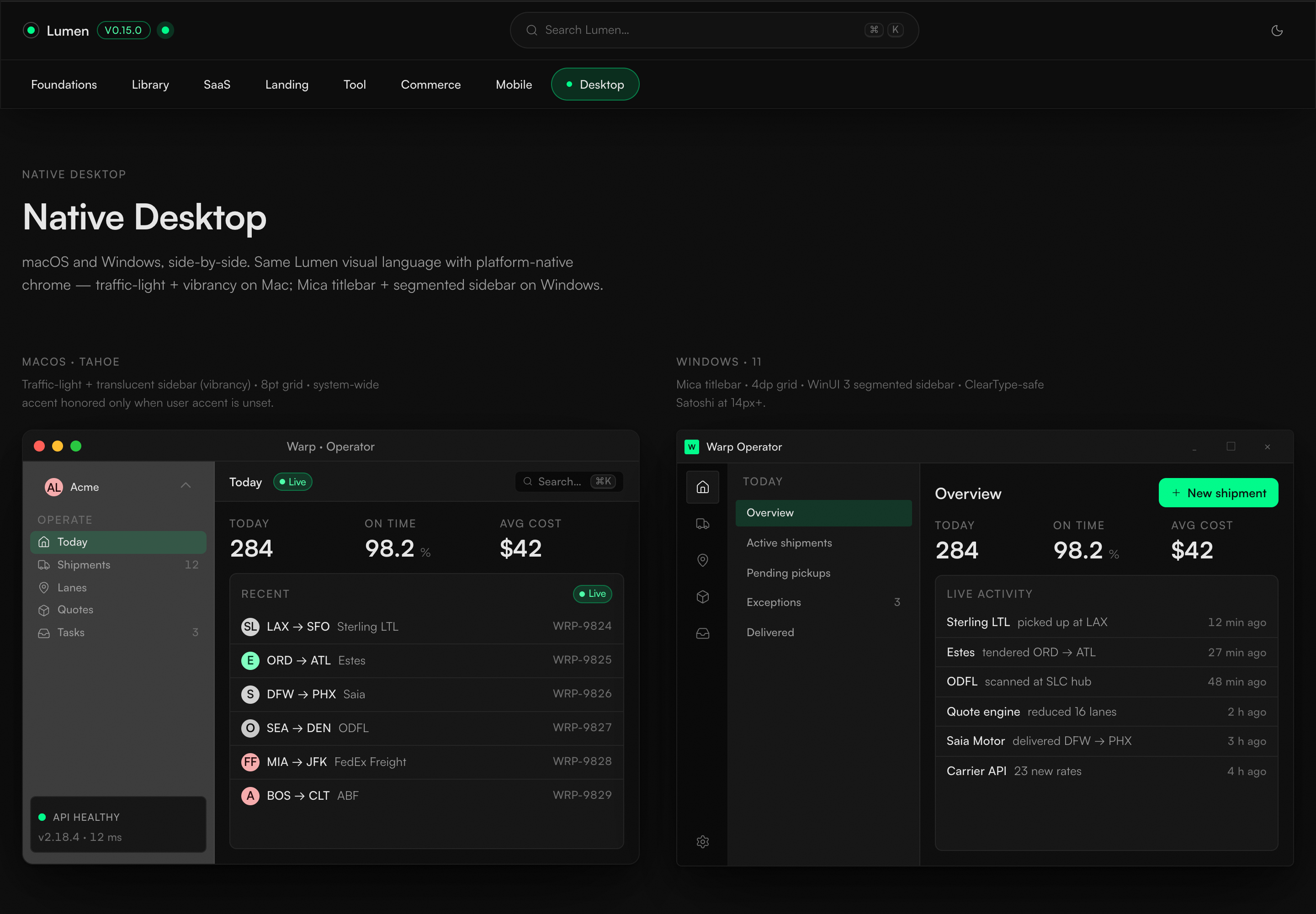
IMAGE UNAVAILABLECurrent macOS and Windows reference surfaces shown side by side.
Desktop references
macOS and Windows retain their own window and navigation conventions while sharing the same semantic system.
03 / Commerce and marketing
Different densities, one visual logic
Product controls and a landing composition led by typography share hierarchy and interaction roles without collapsing into the same layout.
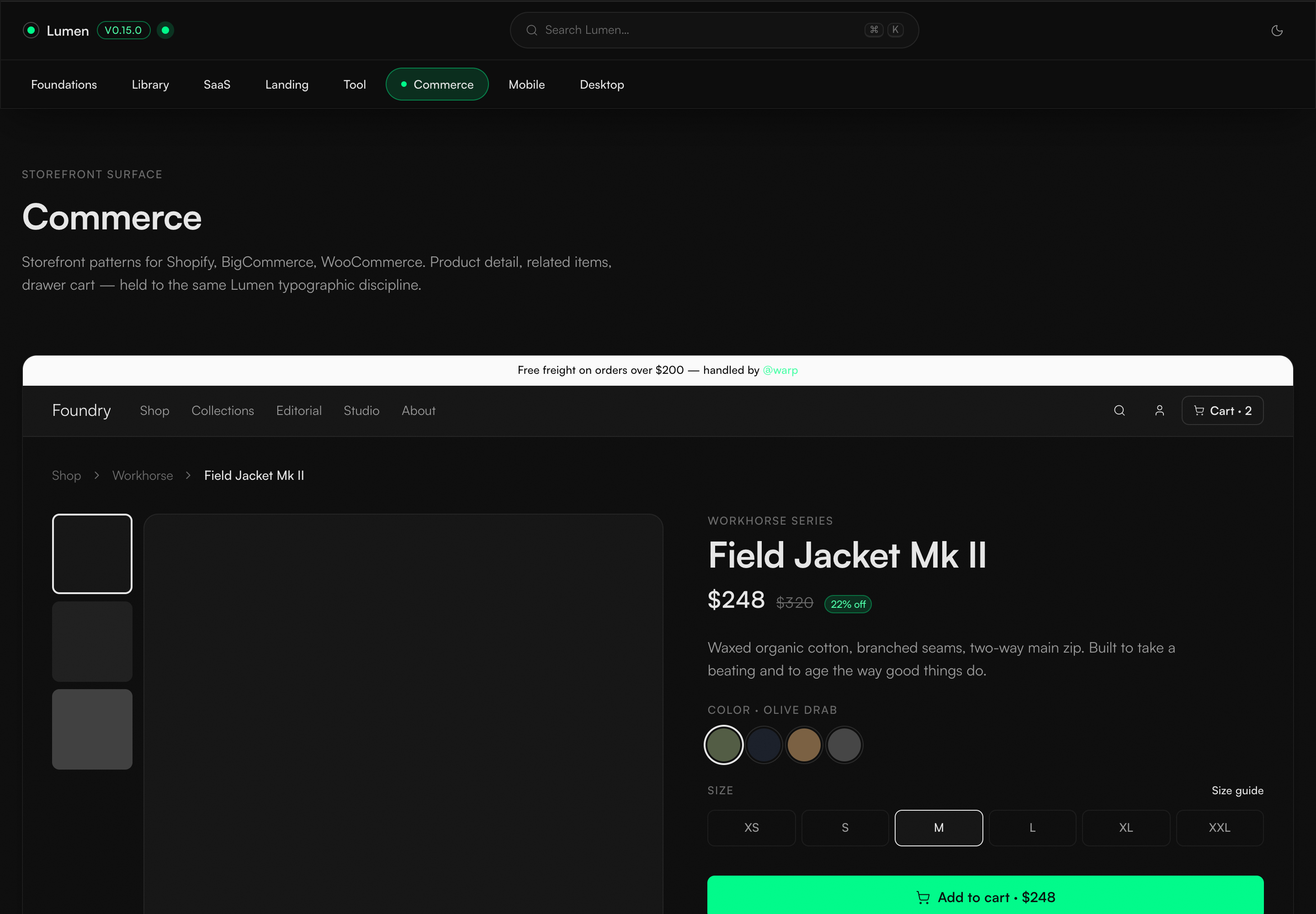
IMAGE UNAVAILABLECurrent commerce reference showing product, variant, price, and cart controls together.
Commerce reference
The product detail page keeps variant choice, price, and the primary cart action legible while adapting the system to a different content density.
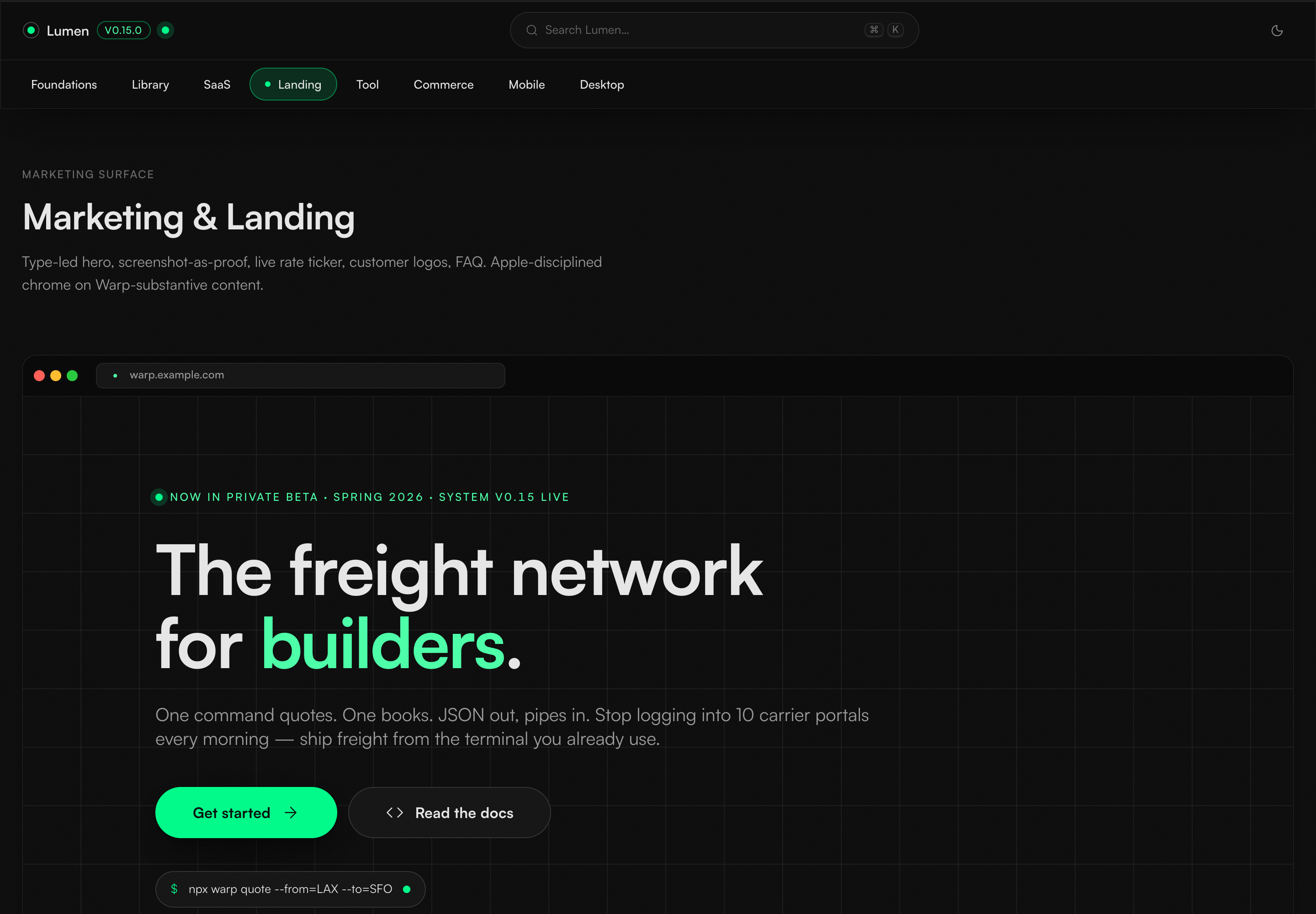
IMAGE UNAVAILABLECurrent marketing reference showing hierarchy, proof, and action on a wide landing surface.
Marketing reference
The landing page uses the same tokens for a story led by typography, browser proof, and one unmistakable primary action.
Review turned recurring defects into clearer design rules
Each issue was traced to its underlying visual or interaction rule, repaired in context, and carried into the relevant reference screens.
01 / Review loop
One repair improves every relevant surface
The review process starts with a rendered interface, names the repeated pattern behind the issue, defines a clearer rule, applies it across contexts, and checks the result where people actually use it.
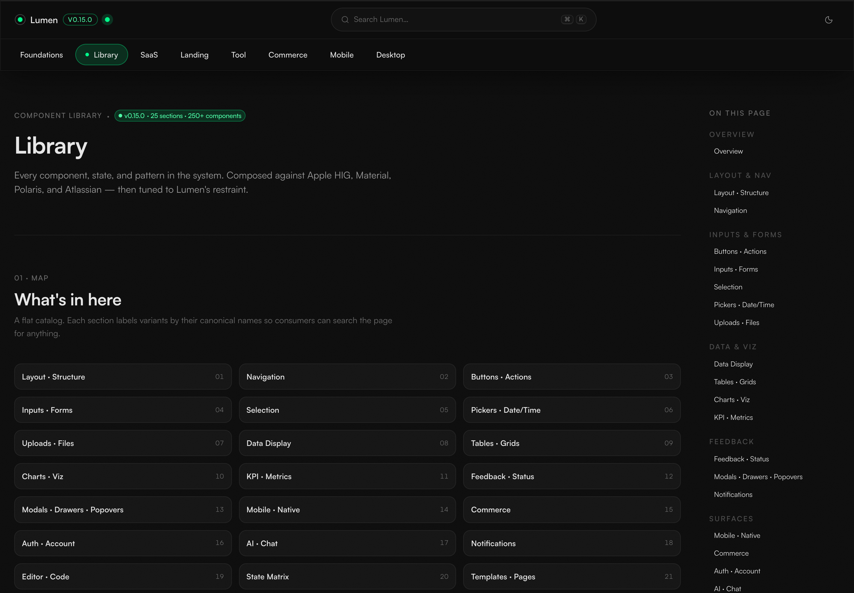
IMAGE UNAVAILABLECurrent component library inventory and navigation structure.
Governed distribution
The current library organizes the design system contract into searchable component categories, so teams do not have to rely on memory.
Review each risk in the surface where it appears.
WHAT CHANGED Interaction, mobile behavior, component anatomy, written guidance, retired colors, and contrast each revealed a different issue. Poor contrast between pale text and green backgrounds prompted a clearer text role and usage rule.
Make the reference screens usable, not merely consistent.
WHAT CHANGED Focus, labels, contrast, responsive behavior, and layout stability were reviewed alongside the visual system so the guidance held up in real interface states.
What this case covers
- The design system rules and reference surfaces led by Neel; wider rollout and business impact were not measured.
- The case demonstrates shared rules across platforms, not complete coverage of every component on every platform.
What changed in the practice
Lesson
Consistency across a lean team cannot depend on people remembering every rule.
Keep
Connect each important decision to a clear rationale and an inspectable example.
Change
Review guidance and rendered interfaces as one design system.
Carried forward
Turn each repeated defect into a reusable visual or interaction rule.