Neel owned research into the current experience, information architecture, the semantic status model, interface content, visual and motion design, interaction details, and the reviewed handoff.
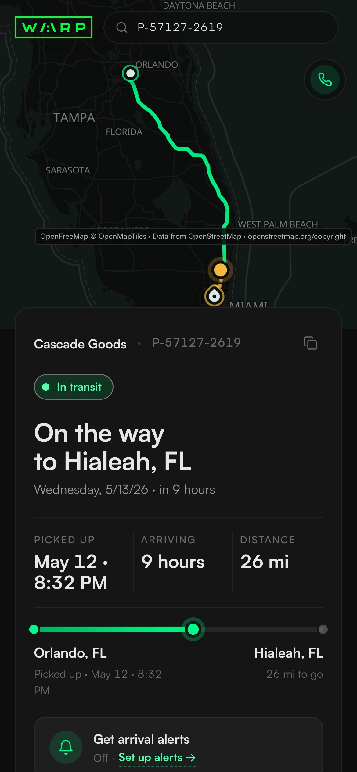
IMAGE UNAVAILABLEShipment in transit view.
IMAGE UNAVAILABLEMobile tracking page overview.
OpenFreeMap© OpenMapTilesData from OpenStreetMap
CASE 03Shipment tracking that starts with the answer
Warp Tracking: Turning shipment status into a clear answer
A recipient may open the page from an email or text with roughly thirty seconds to answer one question: where is my shipment? Warp's old page compressed a much richer state model into four headlines, so cancelled and terminal shipments could receive contradictory copy. Neel mapped the existing experience, defined twelve rules for state priority, and redesigned the hierarchy, controls, and motion so every cue reflects the same shipment state.
Rahul owned the existing product and map experience. Troy set the business frame: retain the map and support path while making the page clearer and more useful for recipients.
The product team retained integration and measurement ownership after handoff.
The old interface could contradict the shipment
The original screen records the trust failure the redesign had to remove, not a cosmetic starting point.
The old green matrix interface exposed rich shipment data but reduced it to four public headlines. A cancelled shipment could be greeted as delivered and still surface a rating prompt, precisely when the recipient needed a truthful exception and a route to help.
- A recipient opening the page from an email or text, often with no Warp account or logistics vocabulary.
- A business shipper needing the same page to remain credible when a shipment fails.
- Work with the shipment information already available and retain the existing delivery map.
- No invented percentages, ETA confidence, or progress.
- Every visible control had to perform the function its appearance promised.
- The reviewed hierarchy, state logic, and motion cues had to survive team handoff without visual drift.
For many recipients this page is Warp's first impression. In a check lasting thirty seconds, a false status or dead control is not polish debt; it is the product breaking its promise.
01 / Before / after
From contradictory terminal copy to a hierarchy that starts with the answer
The redesign moves the computed status, ETA or actual time, journey, and one contextual action ahead of secondary history.
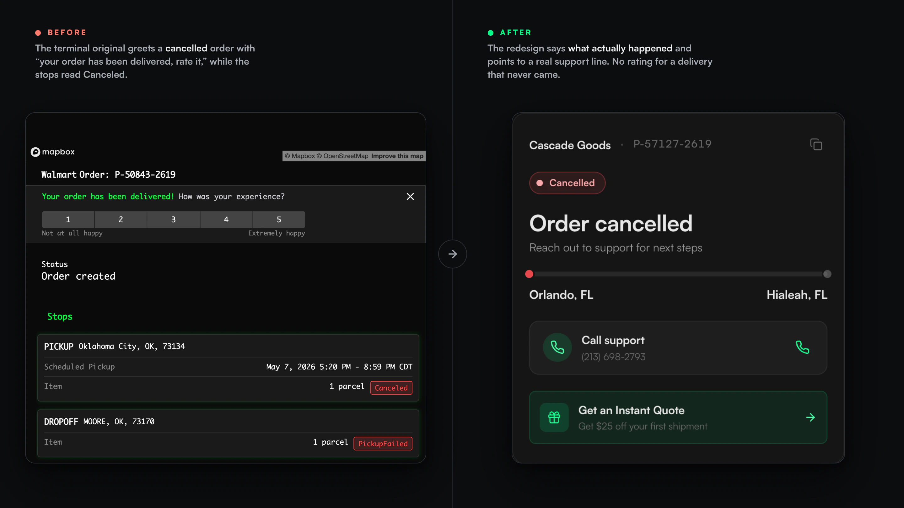
IMAGE UNAVAILABLEOld and new tracking page comparison.
Before / after
The old generic status treatment compared with a redesign that starts with the answer.
Nineteen interface states needed one shared truth model
Twelve priority rules resolve journey stage and terminal conditions before the headline, actions, map, and motion cues appear.
The reviewed set spans the home view plus active, failure, terminal, and return conditions.
Designed for the full journey, not only the happy path.The model determines the headline, tone, action, map stage, and live cues from the same shipment truth.
One hierarchy for every state.An information audit confirmed that the current tracking experience already exposed every field the redesign required.
The redesign reorganized what was already available.The error text in the alerts field measured 9.72:1 contrast.
A focused accessibility check for a critical state.The fixed header was reduced from 88px to 56px so shipment status could lead the page.
More room for the recipient's answer.01 / State truth
Distinct treatments for failure and terminal conditions
Four scenarios show how one shared state model controls copy, action, and movement cues across active, failure, delivered, and return states instead of layering exceptions onto the happy path.
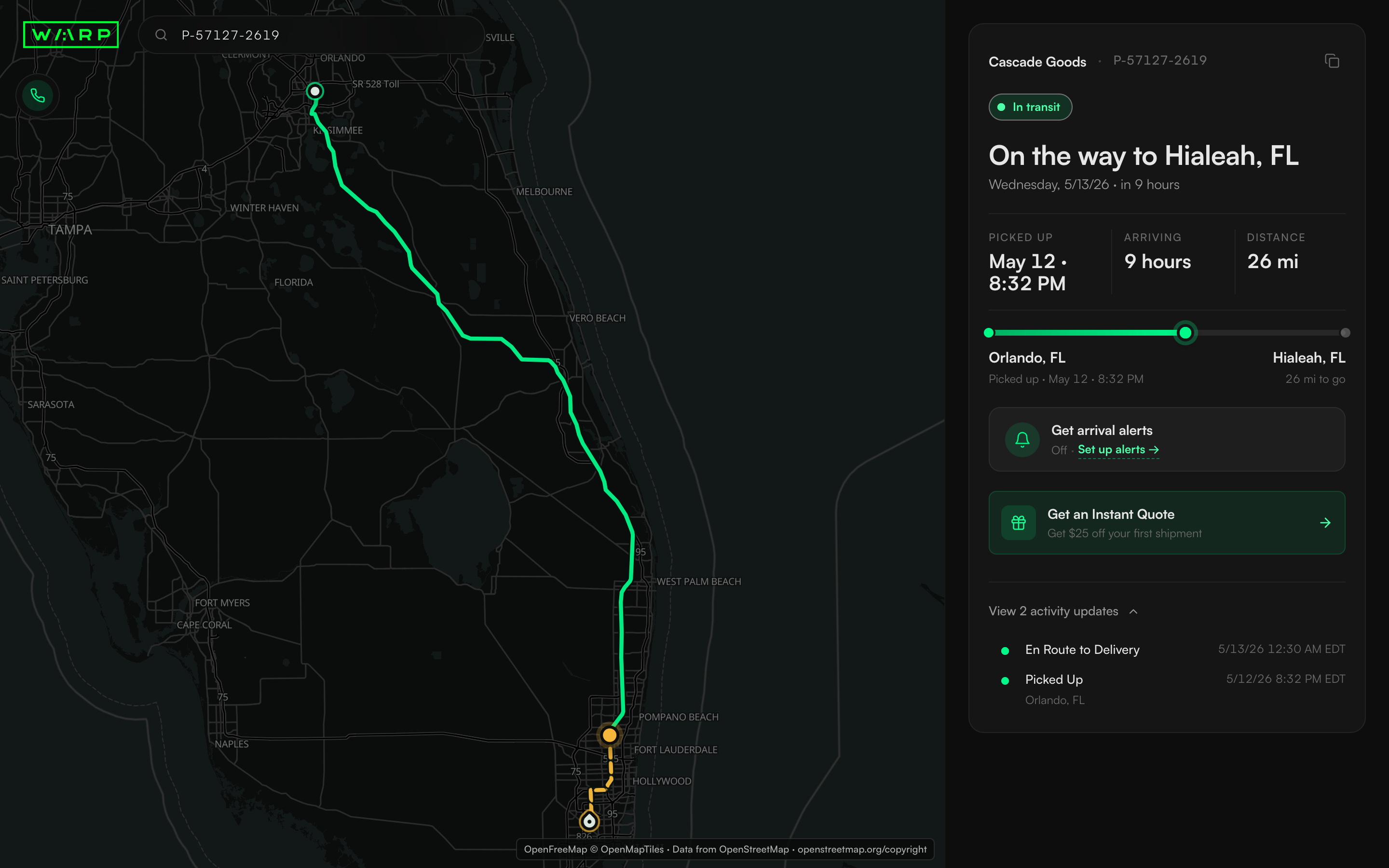
IMAGE UNAVAILABLEShipment in transit view.
Active route
An answer for a shipment in transit pairs the current stage with its ETA, route, and available actions.
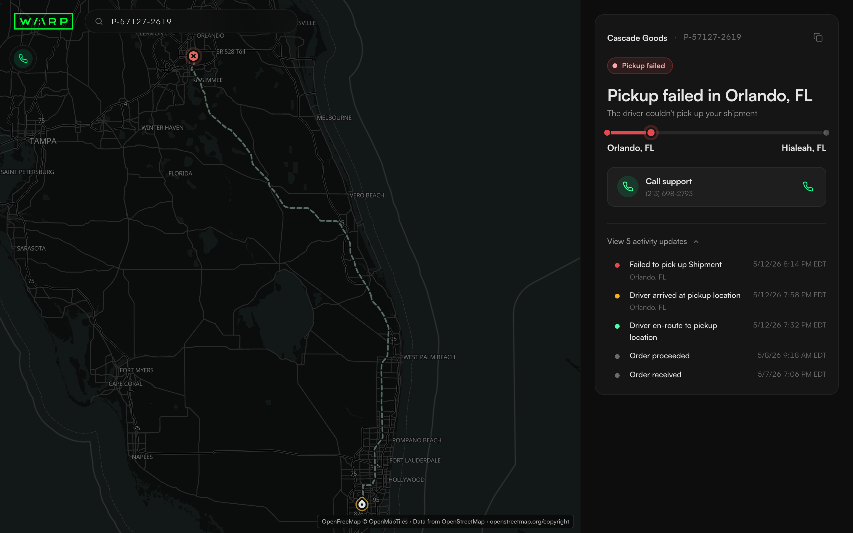
IMAGE UNAVAILABLEFailed pickup shipment view.
Pickup exception
The failure headline, route state, support action, and event history tell the same story.
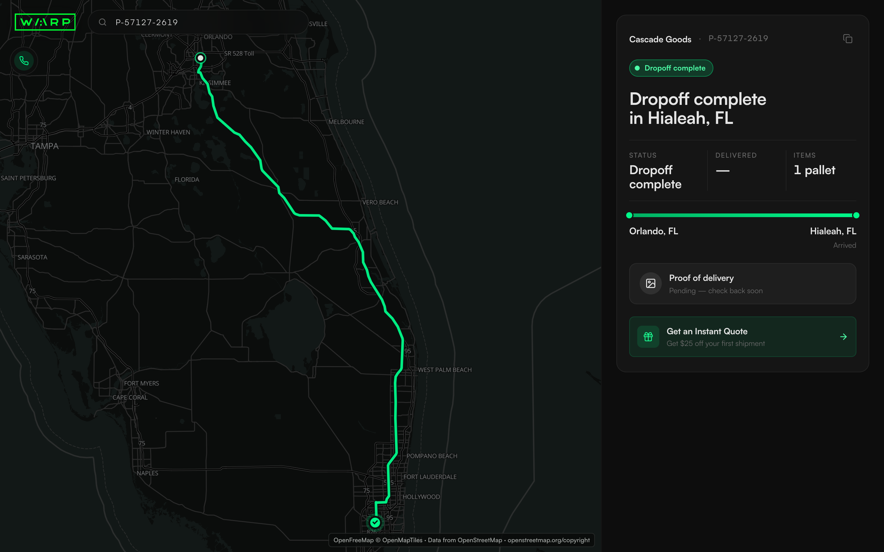
IMAGE UNAVAILABLECompleted shipment view.
Completed delivery
The terminal state closes the route while keeping proof of delivery explicitly pending.
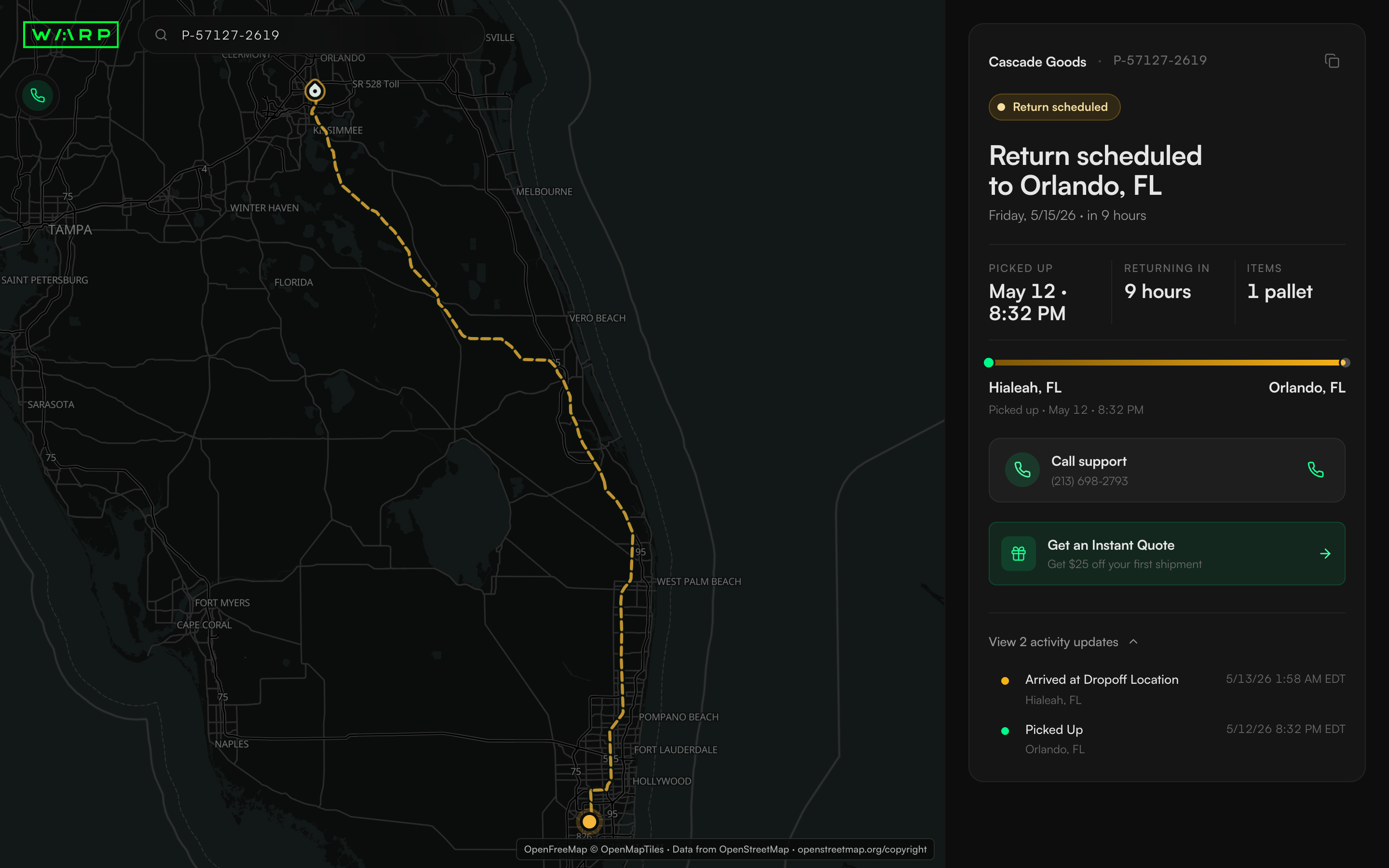
IMAGE UNAVAILABLEScheduled return shipment view.
Return journey
The return state reverses the route and presents the return timing without implying delivery.
OpenFreeMap© OpenMapTilesData from OpenStreetMap
Every visible promise became a behavior rule
Copy, support, alert setup, motion cues, and the design handoff all had to match what the interface implied.
What should the headline say when data and copy for the expected state disagree?
Compute the headline from the real state and hide fields that have nothing honest to show.
A cancelled shipment must never appear delivered, and an unknown ETA must not become a comforting number.
REJECTED PATH Collapse nineteen states into a small set of generic progress messages.
What should happen to controls that look interactive but are not?
Replace the dead overflow menu with a working action that copies the link, route support through a real phone link, and model alert setup explicitly.
The visible affordance and the available behavior must be the same promise.
REJECTED PATH Leave decoy controls or remove every affordance instead of resolving the task.
Can an alert toggle switch on before recipient contact information is saved?
Use explicit setup and configured states instead of a toggle that claims a false state.
“On” with no email or number behind it is still a lie.
REJECTED PATH A toggle that opens a modal or flips on before setup is saved.
How can cues for active states avoid contradiction?
Derive the status pulse, driver, newest event, and map pin from the same computed movement state.
Motion communicates live activity only when the shipment is actually moving.
REJECTED PATH Independent decorative animations with separate state logic.
How should the reviewed experience survive team handoff?
Document the hierarchy, state rules, motion cues, and map behavior as one connected system.
Clear interaction rules let the product team integrate the experience without remaking the visual decisions.
REJECTED PATH Hand over isolated screens without their rationale or behavior across states.
One flow that starts with the answer governs status, action, alerts, and the offer
The core card orders status, time, journey, one contextual action, and optional history; growth cues remain subordinate to shipment state.
01 / Recipient view
Lead with the answer, then show one action that fits the state
The card leads with the order line and computed headline, follows with ETA or actual time and journey, then presents exactly one contextual action. Activity history stays available without competing with the answer.
IMAGE UNAVAILABLEMobile tracking page overview.
Recipient view
The full hierarchy that starts with the answer at mobile width.
OpenFreeMap© OpenMapTilesData from OpenStreetMap
02 / Alerts
Unconfigured and configured alerts are different states
The modal exposes nine real shipment events, with pickup and delivery selected by default. Alerts appear configured only after recipient contact information is saved; customization and disabling remain available afterward.
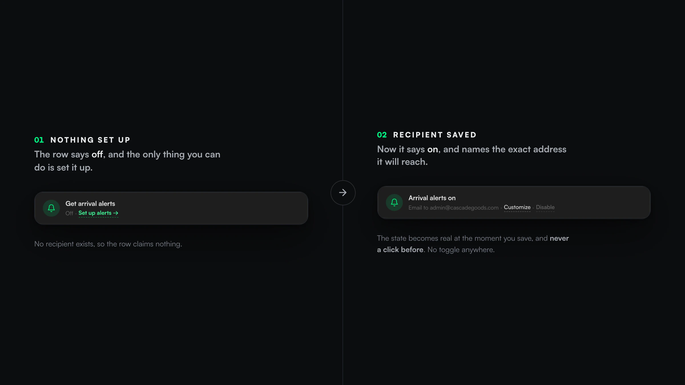
IMAGE UNAVAILABLEUnconfigured and configured alert states side by side.
Alerts
Unconfigured and configured alert states side by side.
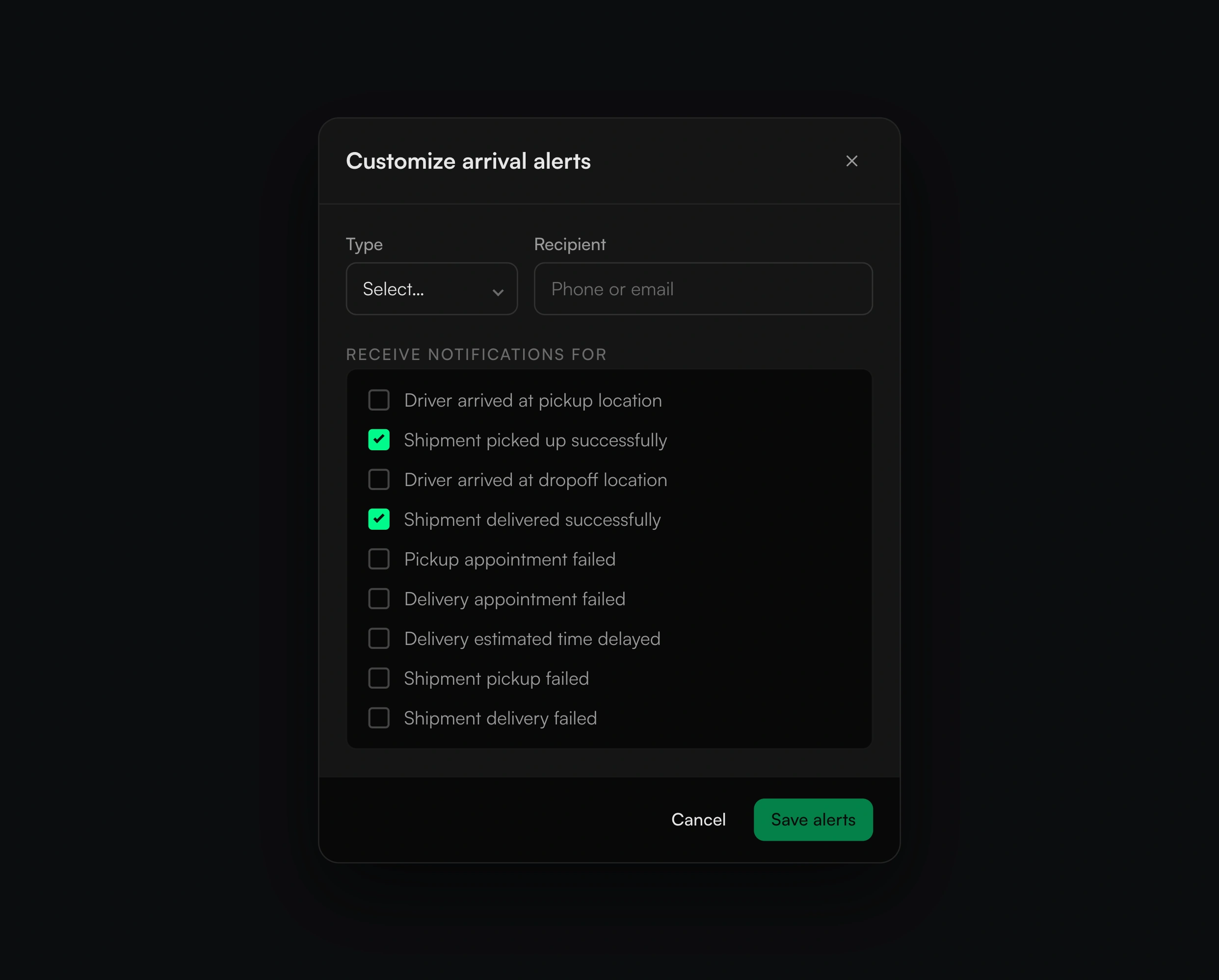
IMAGE UNAVAILABLEAlerts configuration modal for real shipment events.
Alerts
Alerts configuration modal for real shipment events.
03 / Unmeasured hypothesis
A stakeholder growth idea constrained by shipment truth
Troy supplied the first booking offer frame; Neel made its treatment respond to shipment state and suppressed it during failure and return conditions. It remains an unmeasured hypothesis, not a conversion result.
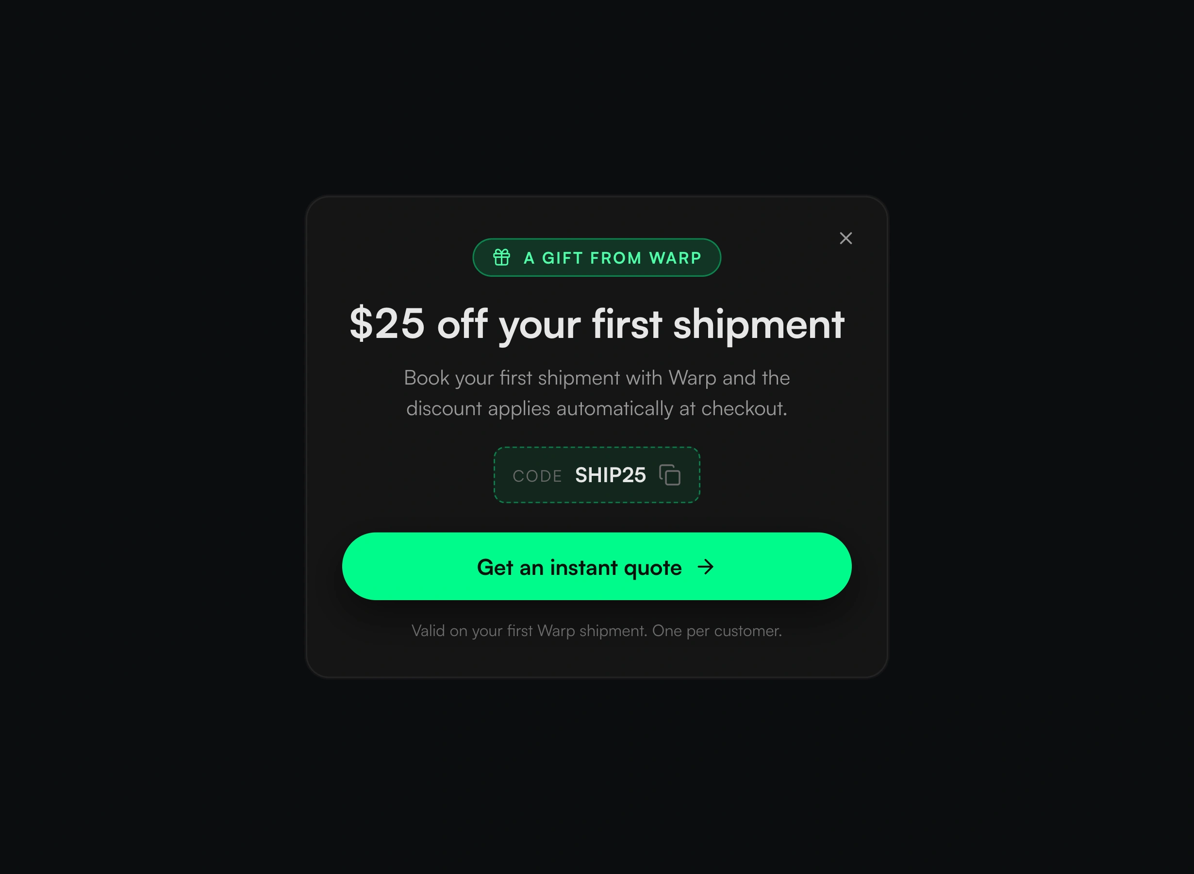
IMAGE UNAVAILABLEThe first booking offer informed by shipment state.
Unmeasured hypothesis
The first booking offer informed by shipment state.
The handoff preserved the reviewed interaction model
The same hierarchy, state rules, map behavior, and motion cues guided both design review and team delivery.
Design with the shipment data already available.
WHAT CHANGED Every field required by the redesign already existed, so the work focused on hierarchy and truthful interpretation rather than asking the product for new data.
Keep state, controls, and motion connected.
WHAT CHANGED The review caught a mismatch between intended and delivered behavior before handoff; the corrected behavior was then applied across states and responsive layouts.
What this case covers
- The redesigned experience, state model, interaction rules, and reviewed handoff.
- Traffic, conversion, and support outcomes were not measured.
What changed in the practice
Lesson
A small page leaves nowhere for a false status or deceptive control to hide.
Keep
Predict what happens on the first click, after an undo, and when someone opens the page directly.
Change
Convert each interaction miss into a rule before another user encounters it.
Carried forward
Refuse invented numbers and ensure motion reflects real state.