Warp TMS
Freight software for booking shipments, following them and handling the invoice
What a TMS is
TMS stands for transportation management system. Say a company needs to move a pallet from one city to another and books it with Warp. After that they get a login to the TMS, and that's where they see their shipments, their lanes, their invoices and their carriers, and where they book the next one. Warp gives it to them for free.
TMS software has been around for decades, mostly as places where you fill in a form and get an answer back. The people who open ours work at the companies that ship with Warp: someone in scheduling, someone in finance, sometimes a director of transportation. They're at a desk most of the day and they're not technical.
Someone shipping with us is handing over something that could be worth multi-million dollars, so they want to see where it is the whole way. If a shipment is on time, though, there's nothing to look at. People open a TMS when a shipment is late, or stuck, or something about it seems off. I learned that from working with the operations team at DoorDash, including their Head of Transportation, Richard Marks, and from Dennis Mullahy, formerly of Macy's supply chain and an advisor to Warp's board. I also spent time at Warp's warehouse in Los Angeles, watching the operations team do their work.
The first version
At Warp we didn't start with user interviews. We started with what the founders and I thought the problem was, shipped a first version fast, then went to a customer and asked. So the first version of the TMS went to DoorDash. Richard Marks and his operations team used it for a while, and then we got on a call where they walked us through how they were using it and where it got in the way.
Three things came out of that call.
The tableOverdue, but by how much?
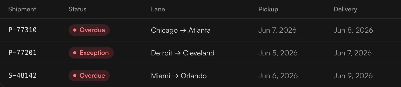
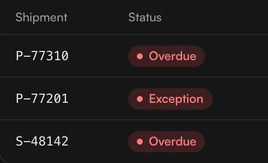
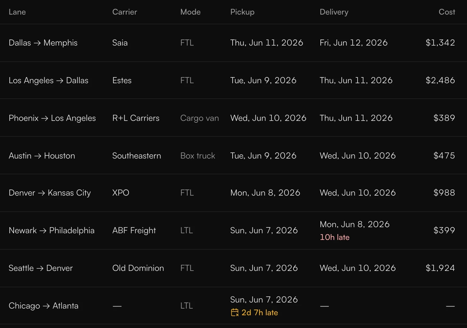
The first was the table of shipments. It said a shipment was overdue but not by how much. Two hours late might need nothing, and two days late might need someone on the phone right away. To find out which it was, you had to click three times.
The coloursWhich one first?
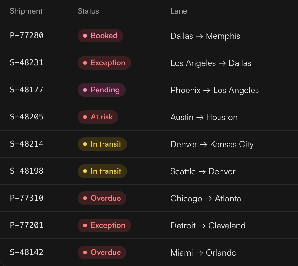
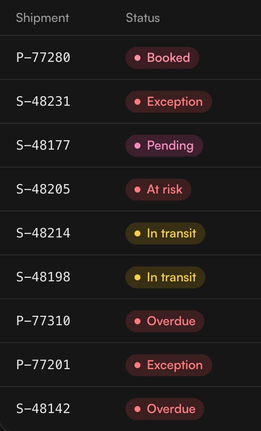
The second was colour, and that one was my call. I'd used a lot of reds in similar shades, and when everything is a shade of red you can't tell which shipment to deal with first. I got that wrong.
The dashboardWhich three?

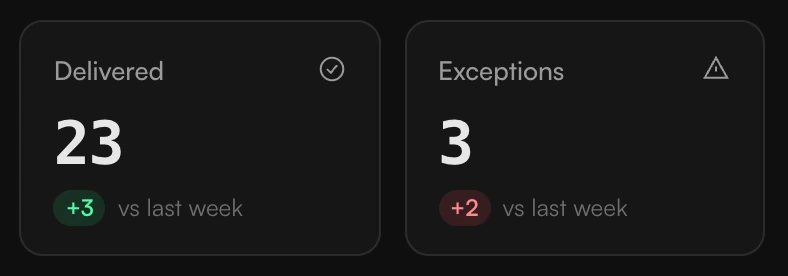
The third was the row of numbers on top: total shipments, in transit, delivered, exceptions. A count of three exceptions doesn't tell you which three, so you clicked through again to find them. I hadn't expected people to want the problems right at the top, but that's what they wanted, and the other counts they'd look at now and then.
What the first screen should show
So what should it show first? I came up with three options.
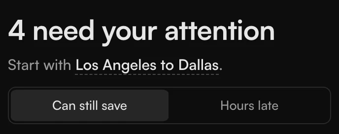
I went with the third. How late a shipment is tells you what to do. An hour late is probably traffic or weather. Two days late is worth a call. So the screen opens on the shipments that need someone, and it names the one to start with.
A screen full of trouble can make people panic, so red is only for the shipments that are really exceptions, and how late goes next to it in words. Everything else stays plain. It also means there's no personal view: everyone sees the same order. If groups ever need a different first screen, I'd do it as a saved view and not as a question on the first run.
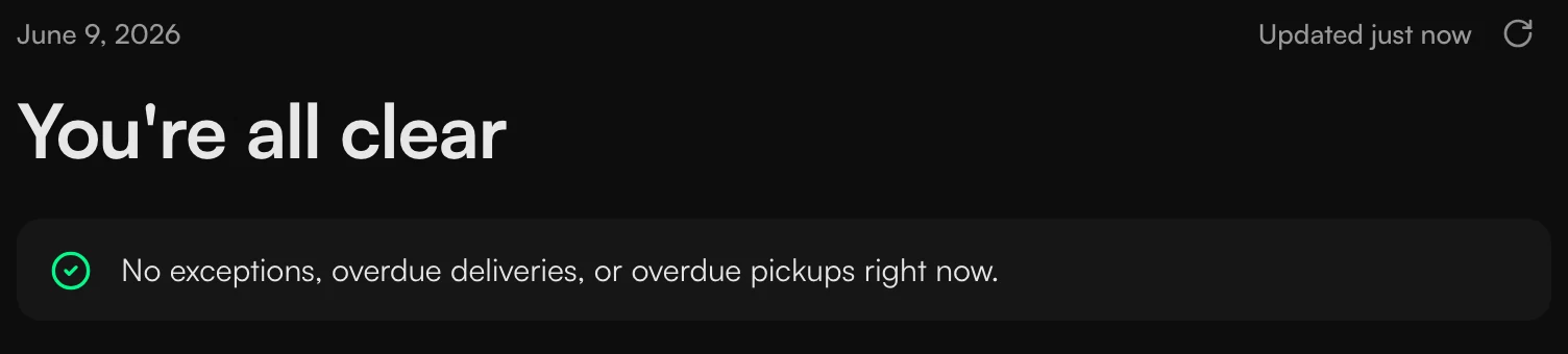
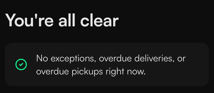
There's a switch for the order. The list starts with the ones you can still save, and if you flip it the latest ones come first. When nothing is wrong, the headline says so and the card gets shorter.



One timeline for all of them
Once the first screen was going to list the shipments with problems, I had to decide how to draw them. I designed four versions.
One had a tab for each shipment. It looks fine on a desktop, but on a tablet or a phone you'd need a separate layout. In another, each shipment had its own timeline, but a timeline is the same for every shipment, so repeating it only made the page taller. The third had no timeline, and then you have to read every row to find the one that's furthest behind.
Tabs
A timeline each
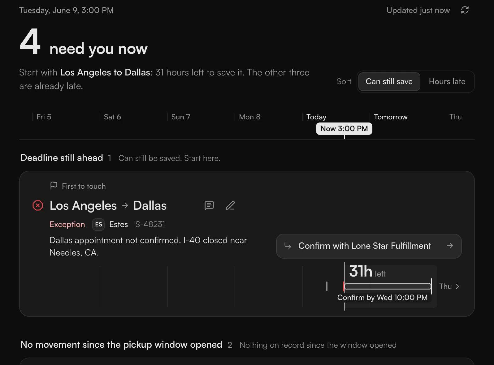
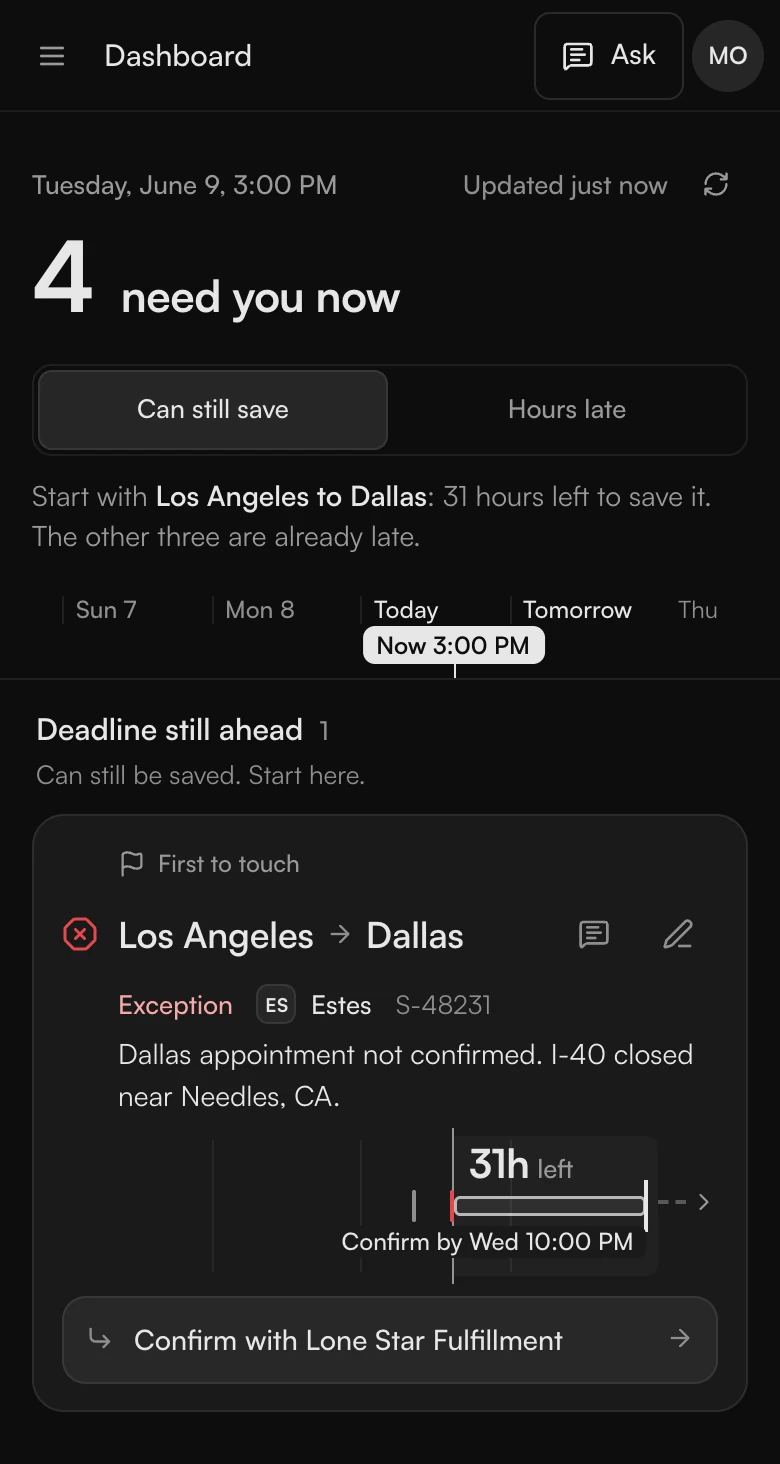
No timeline
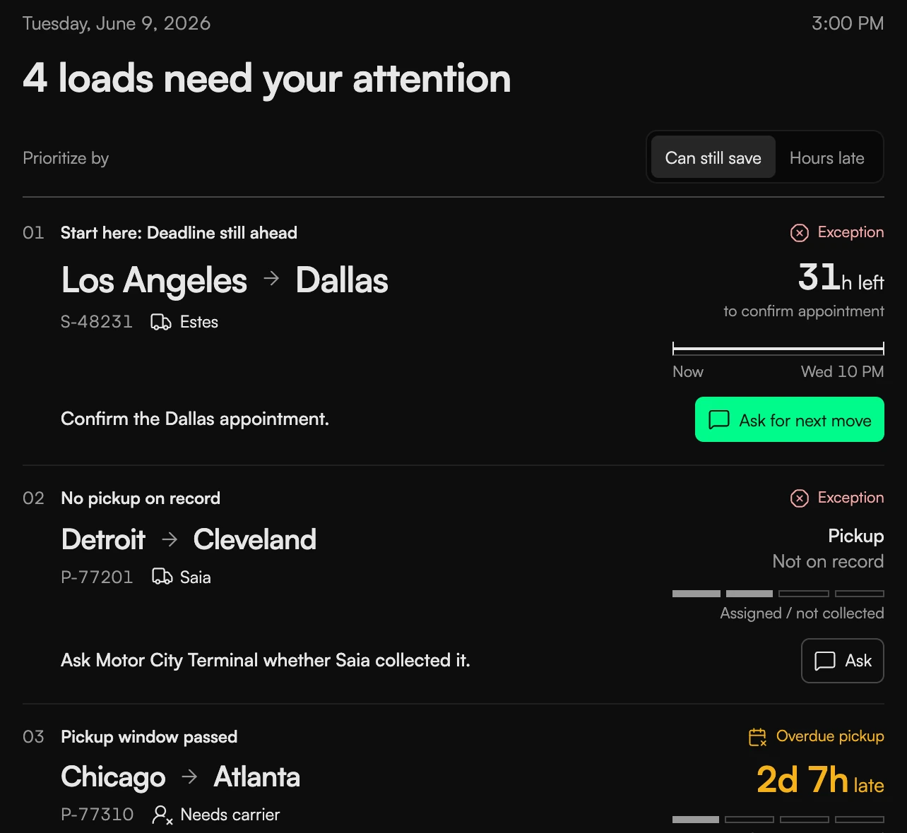
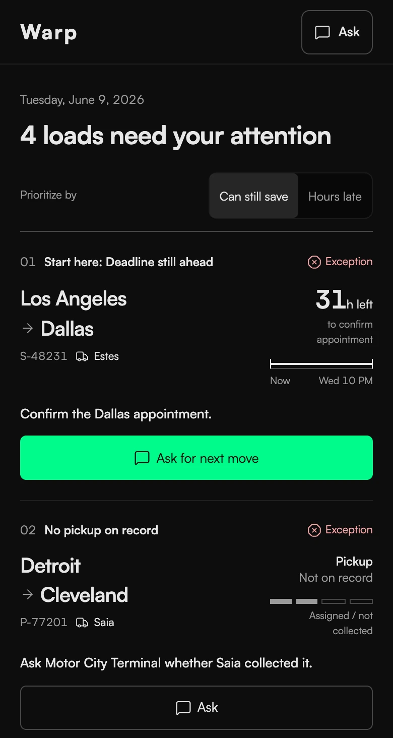
One timelineChosen
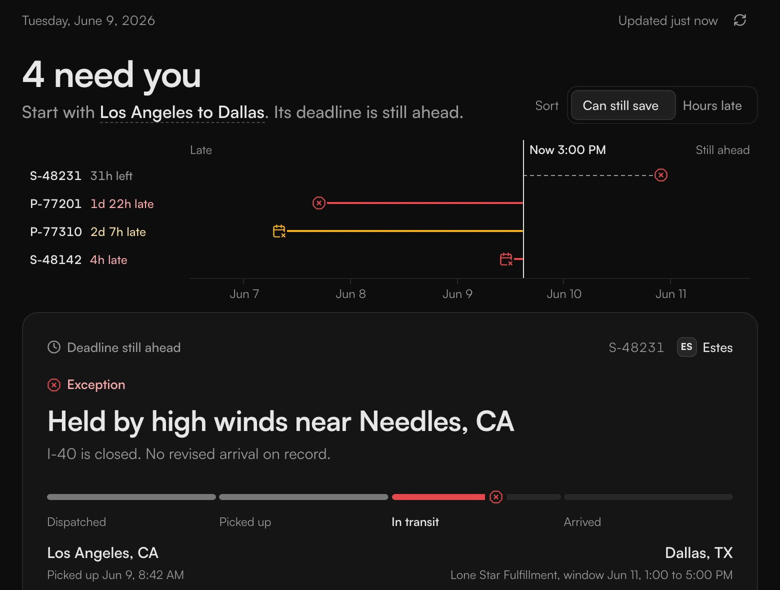
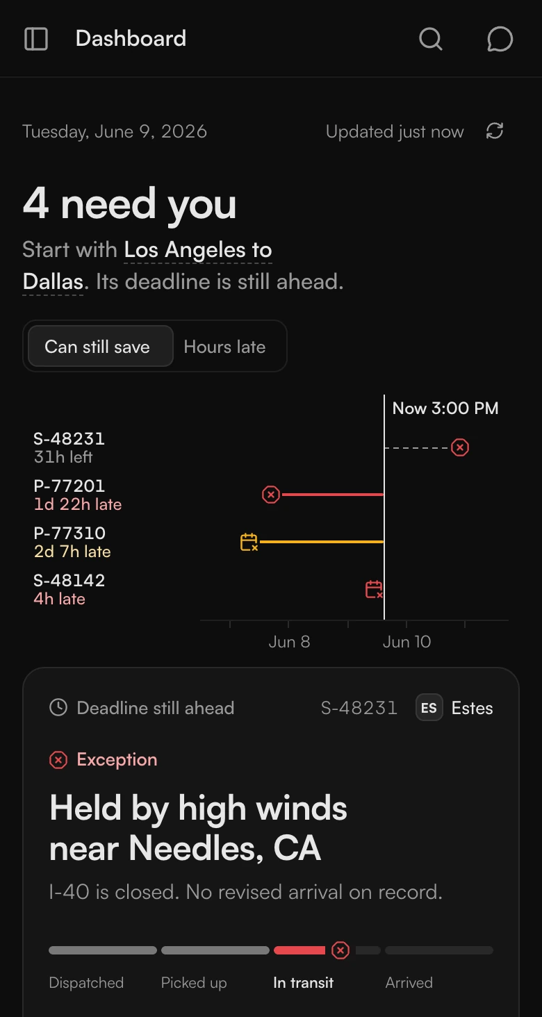
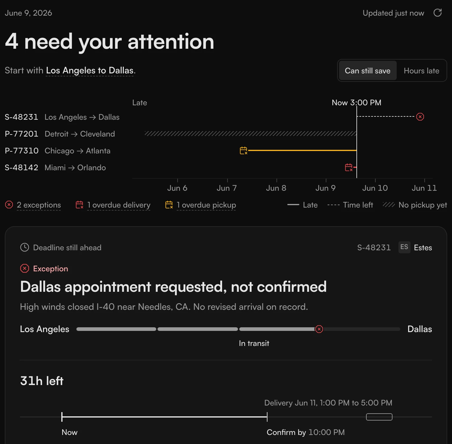
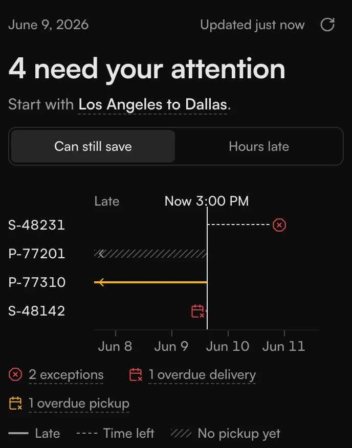
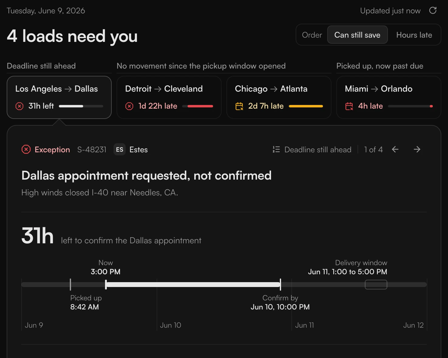
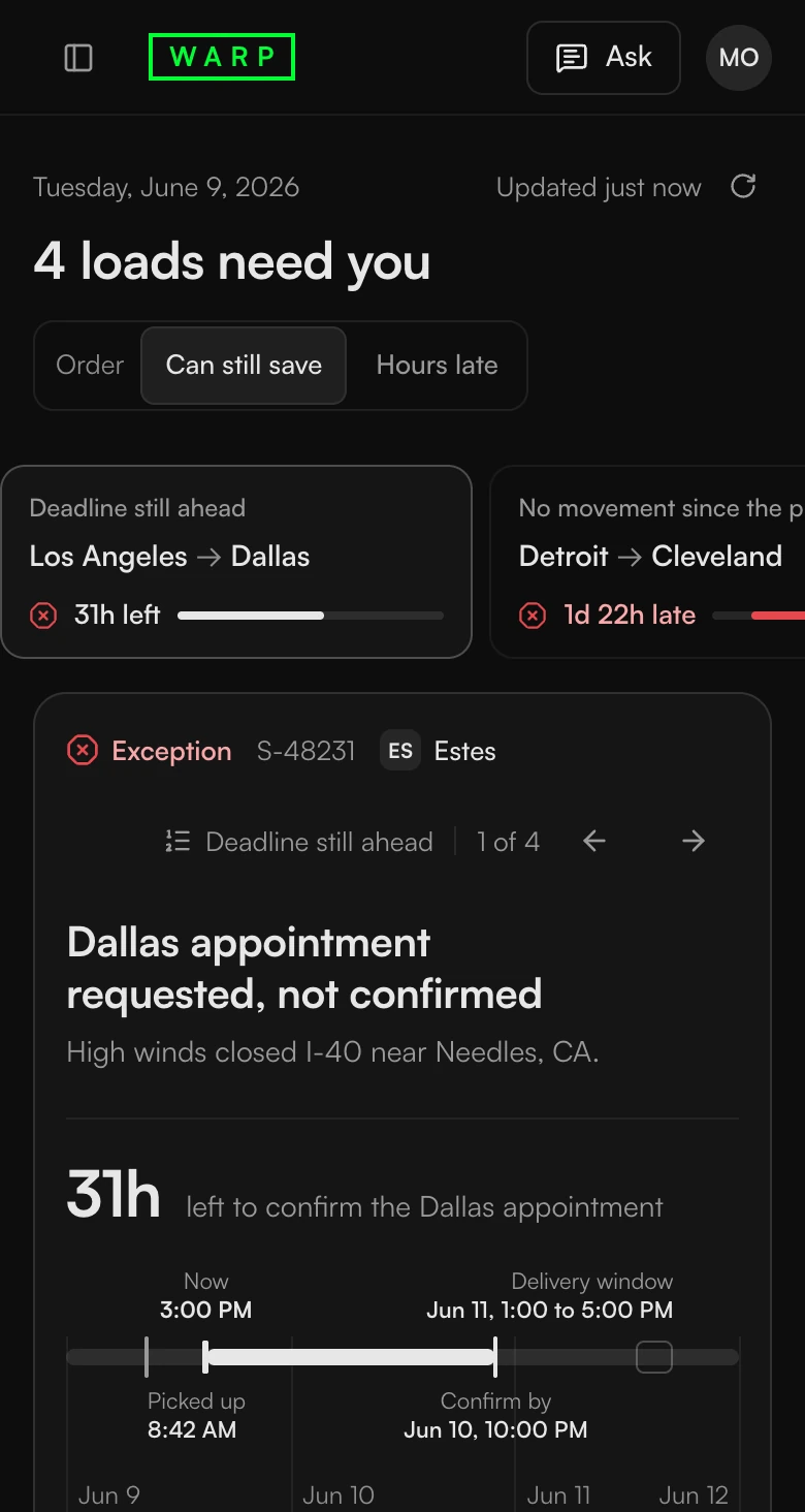
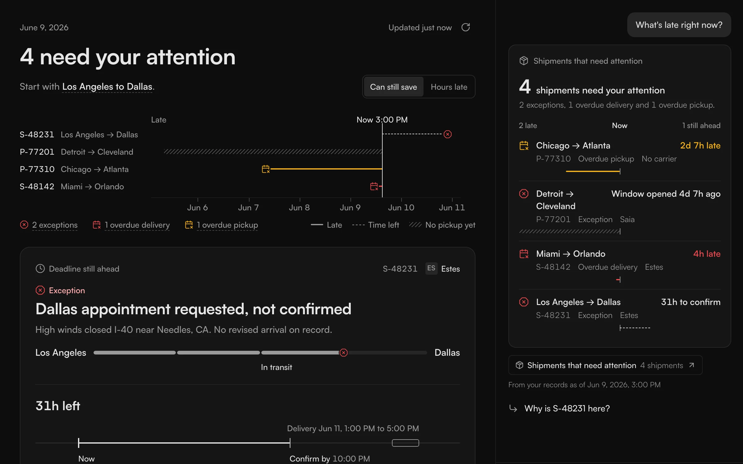
The last one puts all of them on one timeline. It shows how late each shipment is next to the others, so the worst one is easy to spot without reading anything. You scan it. A line marks now. A solid line is how late a shipment is, a dashed one is the time left, and a hatched one means it hasn't been picked up yet.
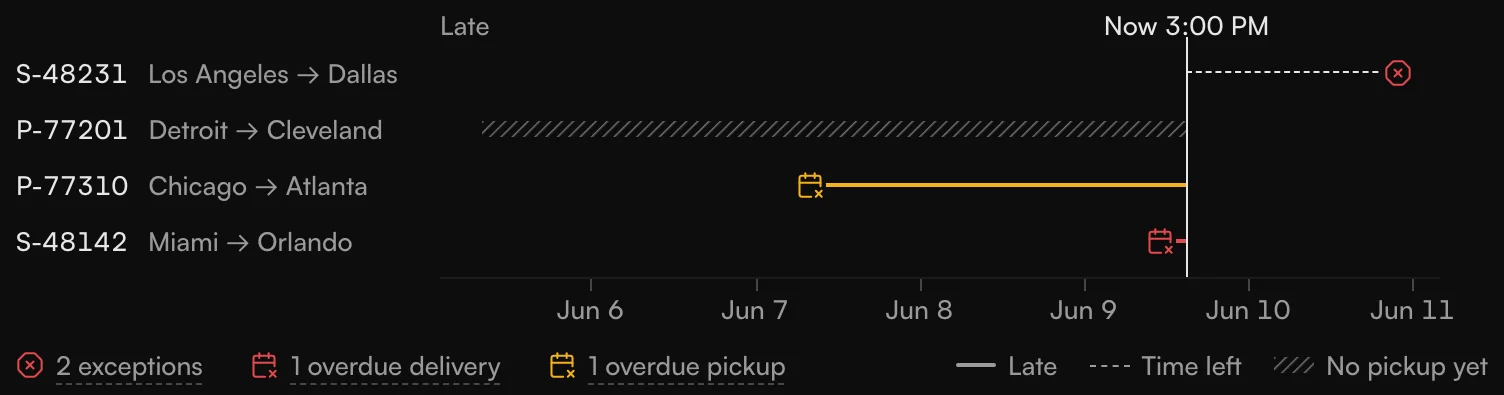
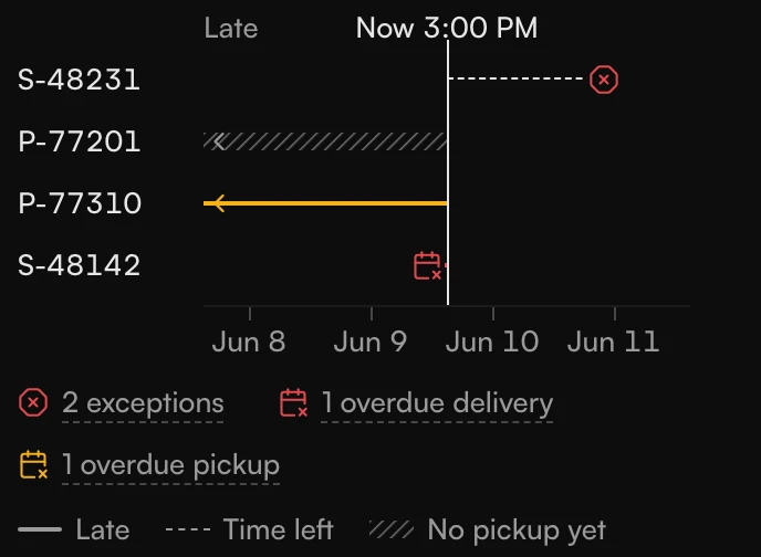
How many fit? Warp's data analyst went through about a million customer shipments, and the most with an exception at the same time was six. So the timeline holds up to six. This screen shows four.
Under the timeline each shipment gets a card, and the first one is bigger than the rest because the question on the page is which one first. The count in the headline is the largest thing on the screen, so the eye knows where to start.
Five fields for a price
The TMS we tested against asked for 19 fields before it showed a price. The price is when someone decides whether to ship with us or with another carrier, so that's a lot of typing before the decision.
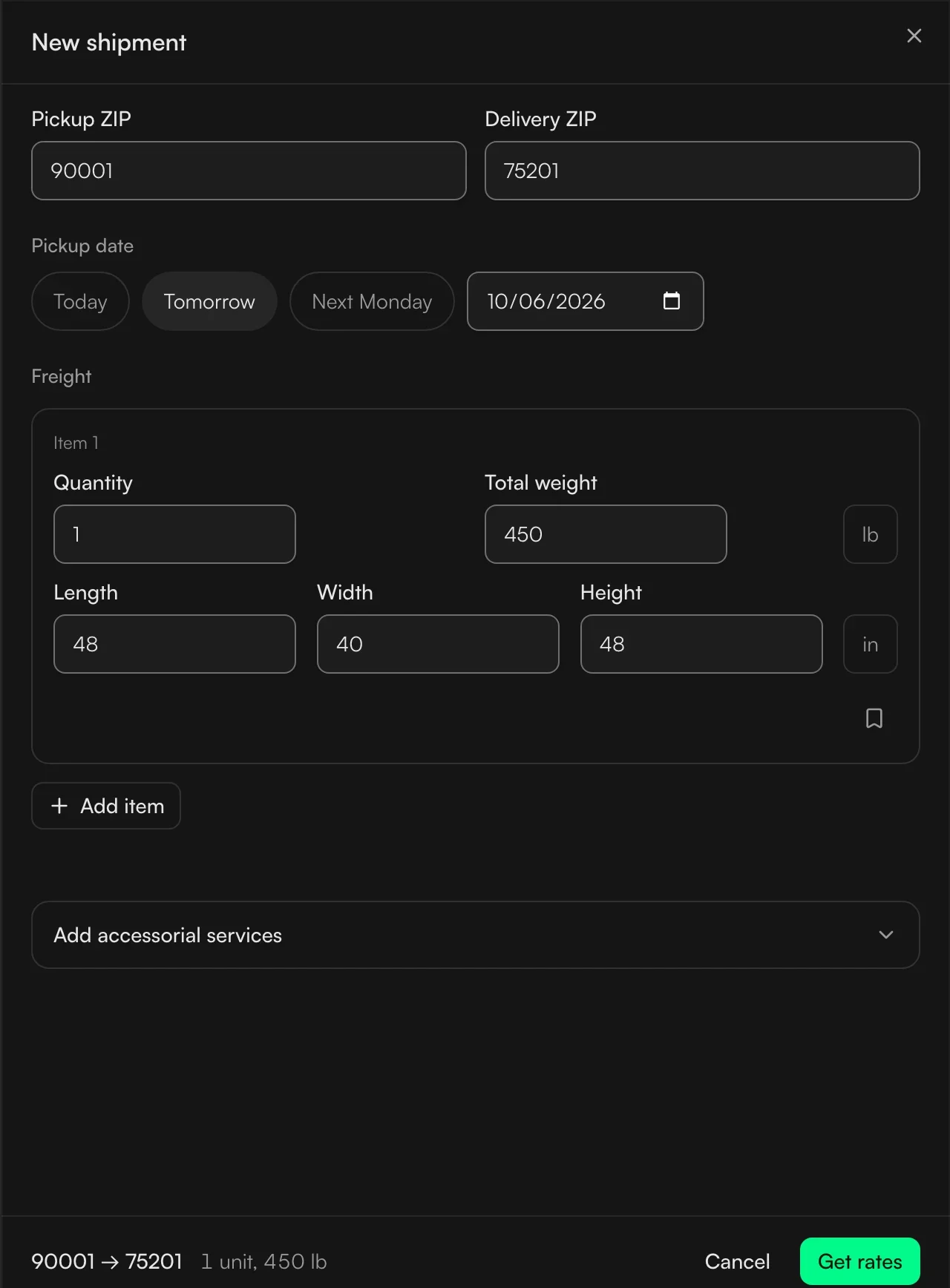
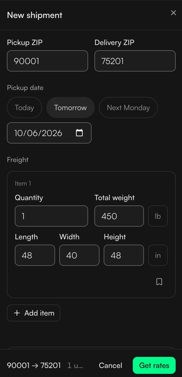
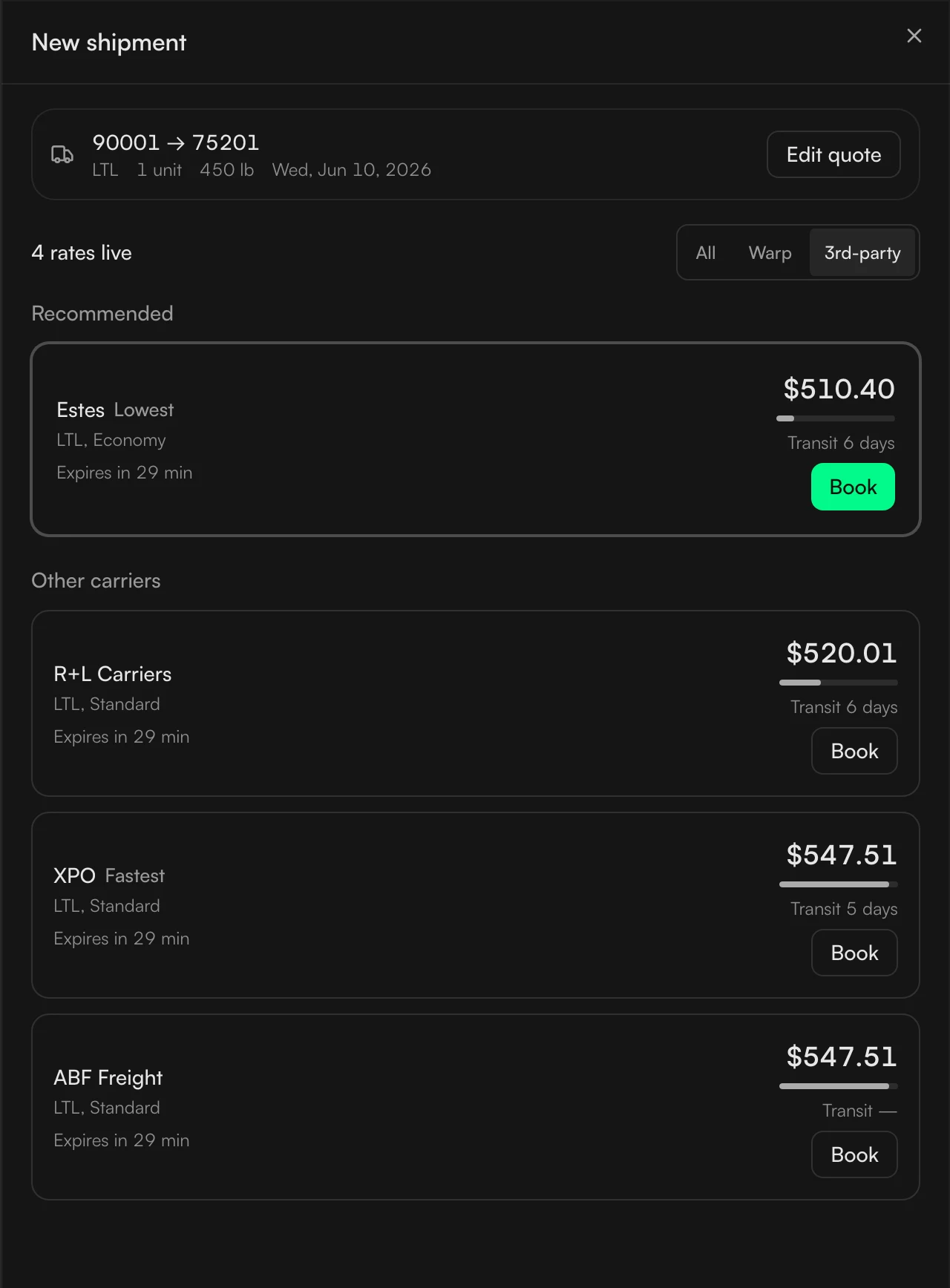
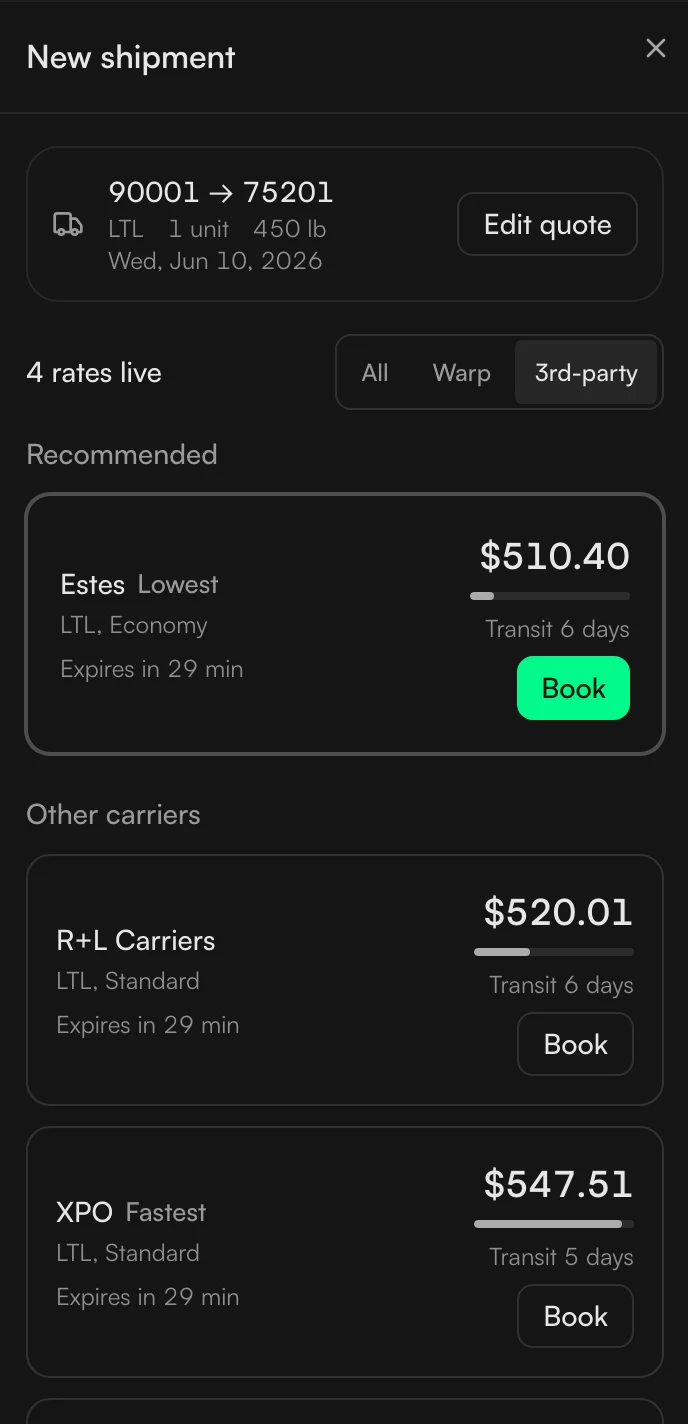
We cut it down. Besides where and when, ours asks for five things: how many items, the total weight, and the length, width and height, because those five are what Warp's pricing uses. The prices come back as a list with the cheapest one marked.
Two rows of boxes. The first row has 19 boxes, labelled 19, for the TMS we tested against. The second row has 5 boxes, labelled 5, named items, total weight, length, width and height, for ours.
When we do not have the data
In freight, a wrong number is more dangerous than a missing one, so a few rules follow from that.
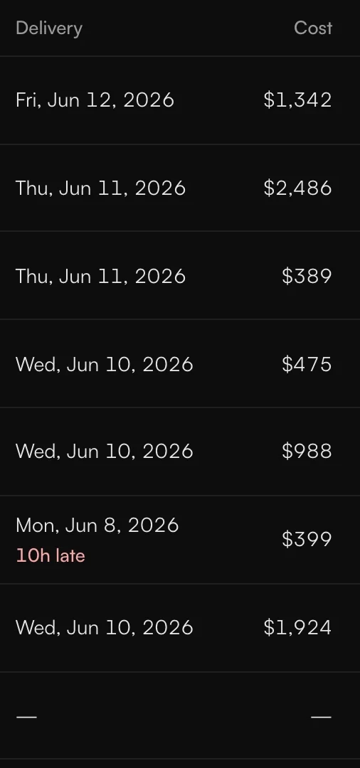
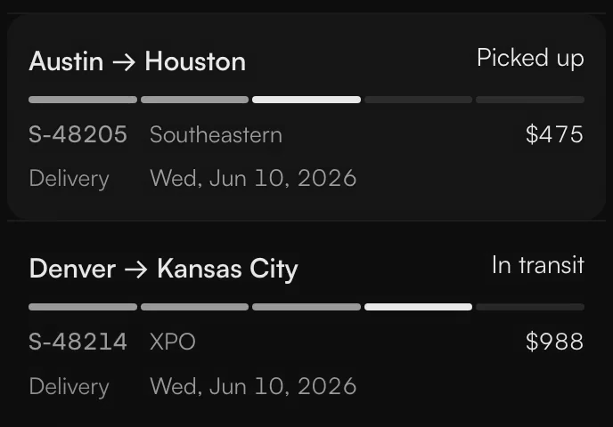
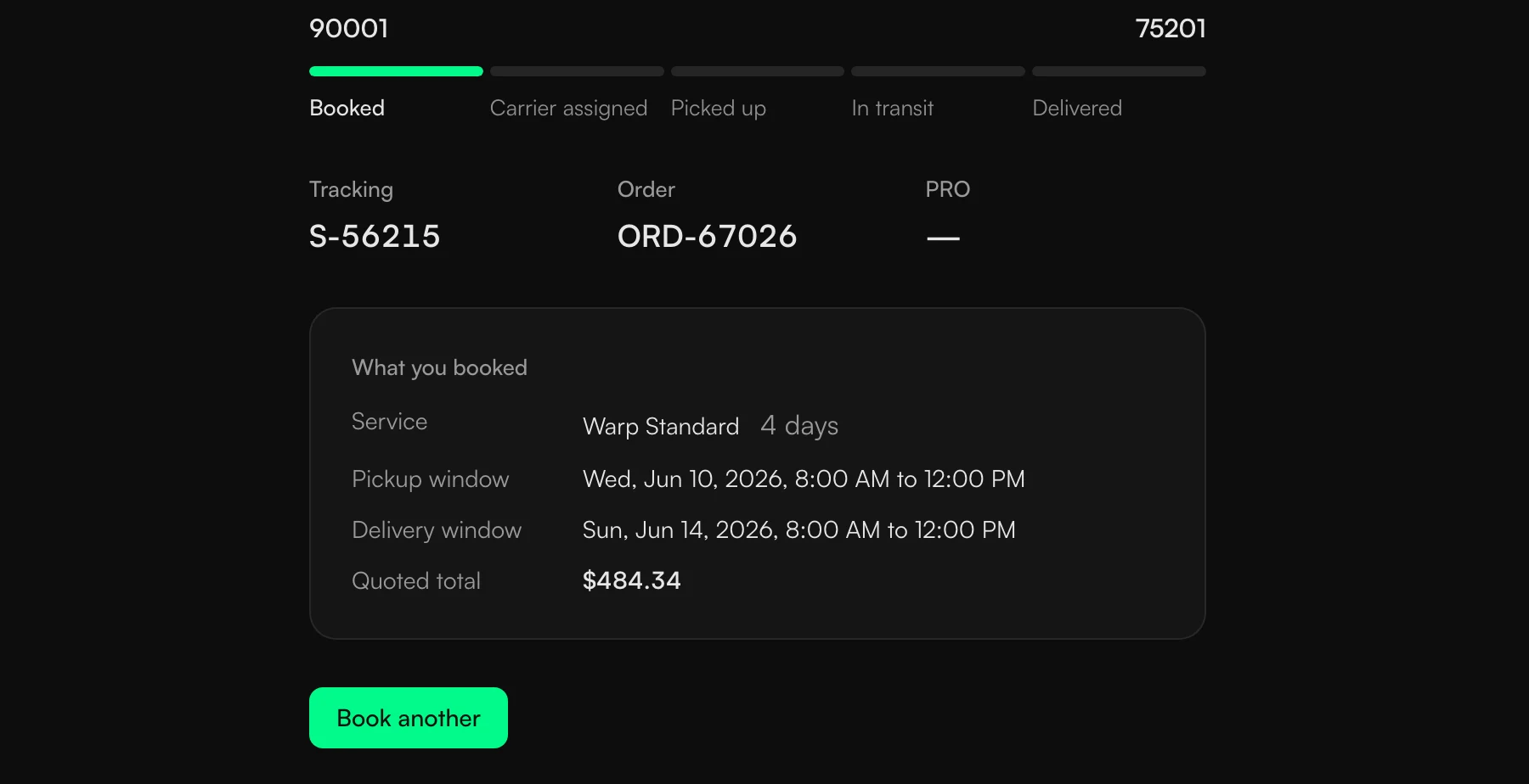
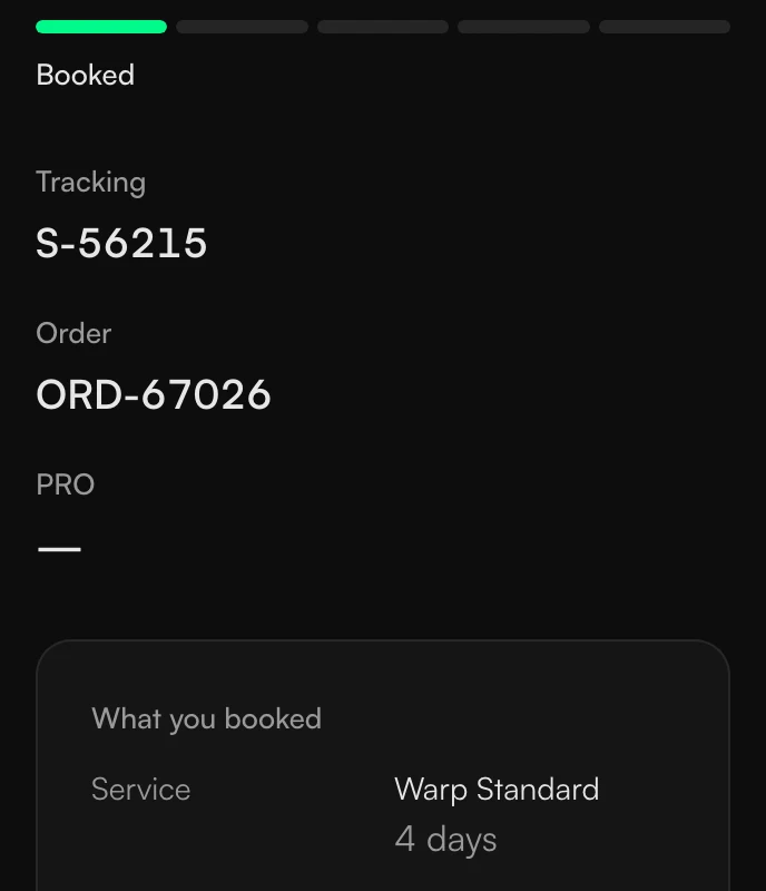
If we don't have something, the screen shows a dash, not a guess and not a zero. A dash in the carrier column means no carrier has been assigned yet, and a dash in the delivery date means there isn't one. People can call someone to find out.
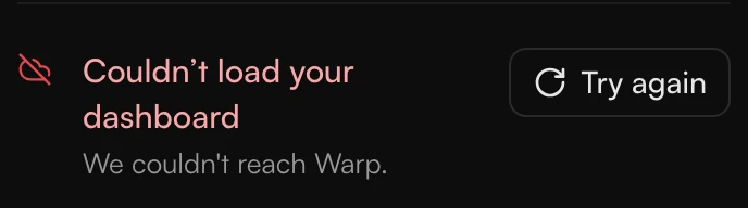
If the TMS can't reach Warp's system, it says so and offers to try again. It doesn't fall back to an older copy, because someone might act on a status that has already changed.
Forms start empty. Nothing is filled in for you, because a shipment booked for the wrong place or the wrong day is expensive to fix.
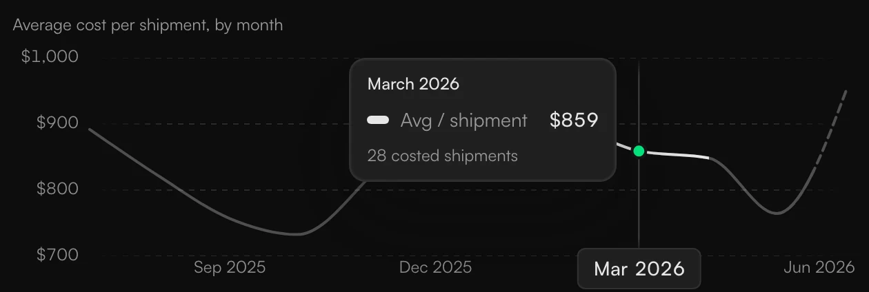
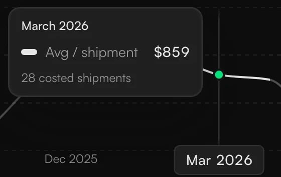
Charts do the same. A month with no data is a gap, and hovering over a month shows its value and how many shipments it's based on.

How it moves
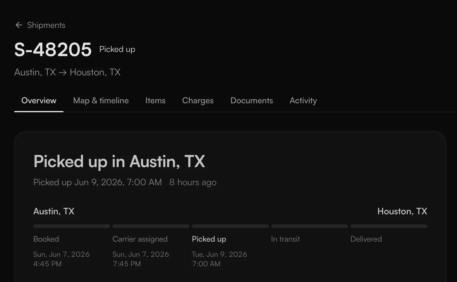
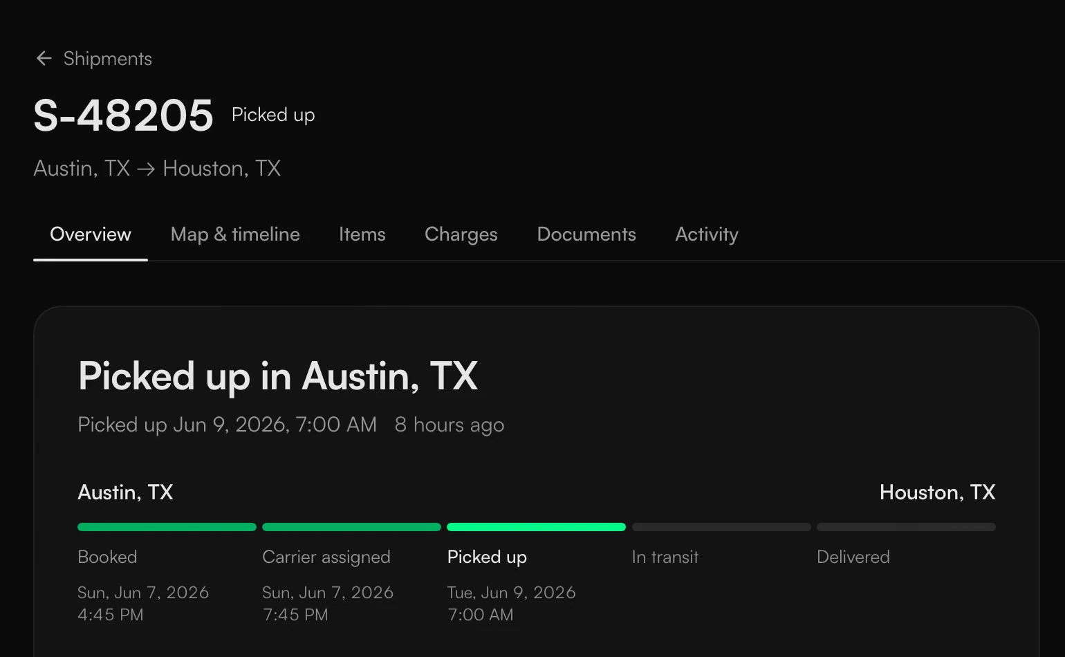
Most software like this doesn't move much. I wanted this to feel a little alive, without slowing anyone down. Typing, search and moving between pages are instant, because people do those all day. What moves is the dashboard settling in once when you open it, a status changing, a booking being confirmed, and charts drawing in.
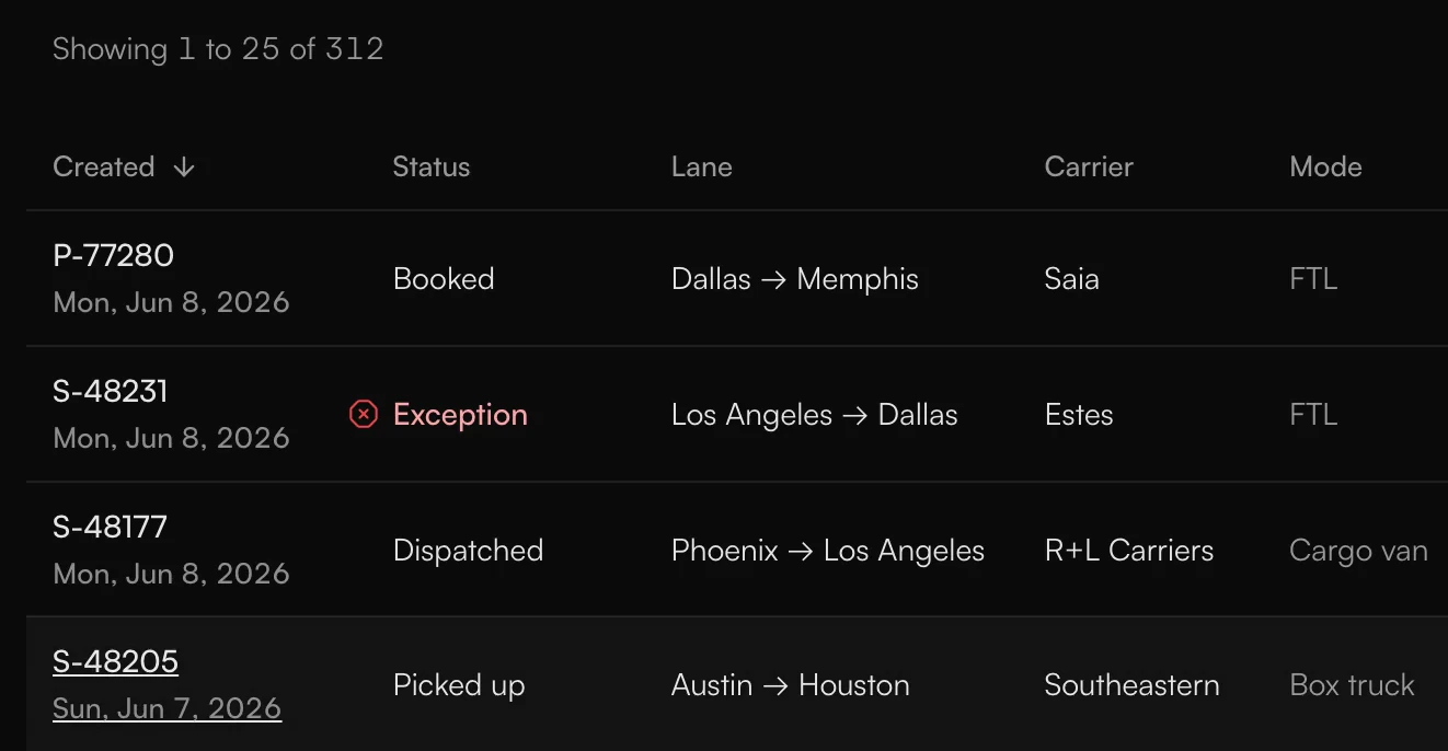
When you open a shipment, its number moves from the row up into the page heading, so you can see where you went.
Where I used AI
I didn't plan to put AI in this at first. A lot of the people who use a freight TMS aren't very tech savvy, they're used to filling in long forms, and I didn't want to overwhelm them.
I also read what people in logistics say about AI in public forums. Mostly it wasn't hostile. It was people asking how they're supposed to trust the data, or trust it when they're auditing something. And whenever an AI gives you an answer, the first question is whether it's even real and where you can see the actual data.
So the question became what AI could do that solves a real problem for the person at the desk, without forcing anyone to use it. The next chapters are my answers. They're live at Warp now, and each one either shows where its answer came from or says what it can't do.
Why a load is here, and what to do about it
Back to the card at the top of the dashboard. Every shipment on that list says why it's there, straight from the record, and what to do next. This one reads: Dallas appointment requested, not confirmed. High winds closed a highway near Needles. No revised arrival on record. The next move is to confirm with the receiver before the deadline. The first priority was always to show what needs an operator's attention and what's going wrong with it, so the reason is on the card. Whoever opens the product can see it right away, see how late the shipment is, and make the call on whether to do anything.

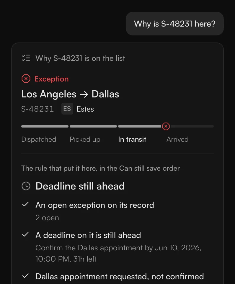
I'd noticed the AI was there but you couldn't get to it in one click, so each card carries two ways in. Why is it here? opens Ask beside the page and shows the checks that put this shipment on the list, each with what the record says. Draft the update is the other one; that's next.
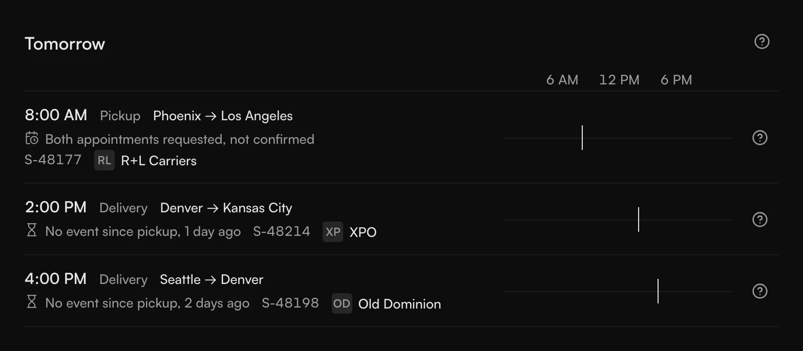
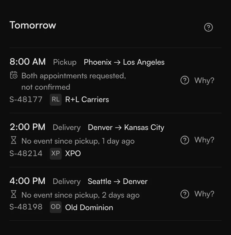
Shipments due tomorrow that haven't had an event since pickup get their own group, Tomorrow. It lists them as facts, like no event since pickup, one day ago, or both appointments requested, not confirmed. It doesn't try to predict which ones will be late.
What to tell people
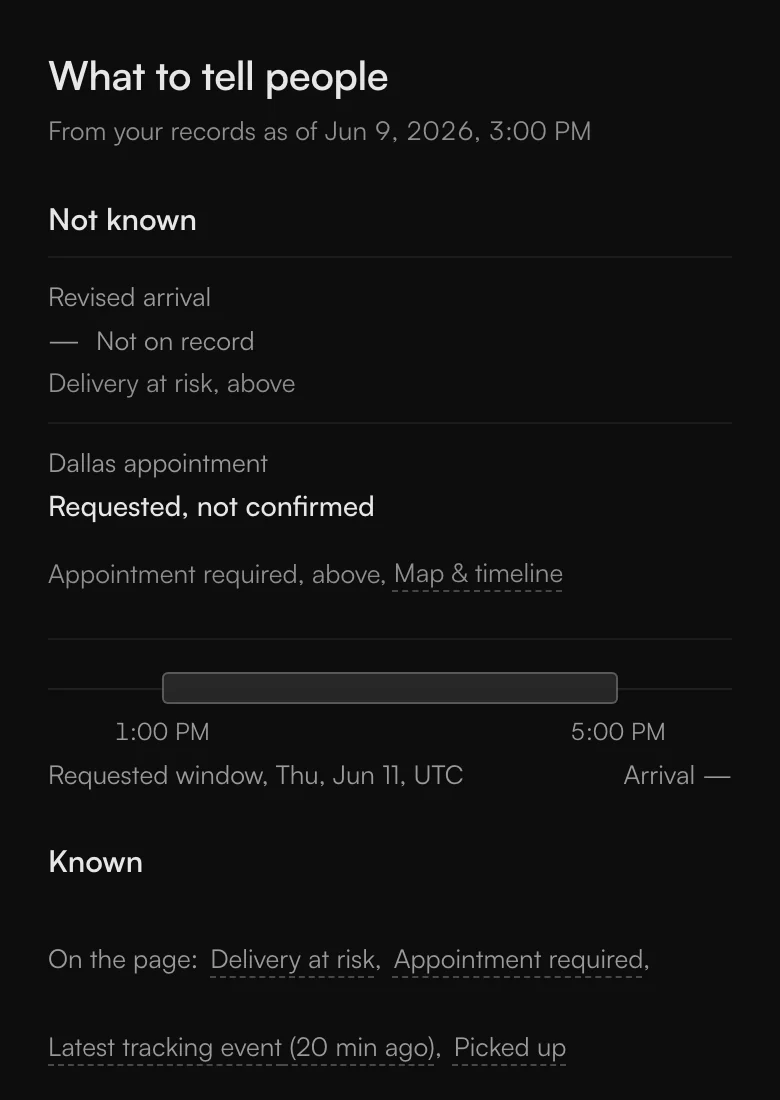
A shipment page can tell you what's going on, but then somebody has to tell the customer, the receiver and the carrier. This is a small quality-of-life thing. If a shipment is two hours late or ten, the TMS checks the details in the record and drafts the message with the exact details.
The first version wrote a summary. A summary can blur what's known with what isn't, like promising Thursday when Thursday was only the window we'd asked for. The feedback we got was that it wasn't much use, so I changed it.
Now the update starts with what's not known yet, like revised arrival, not on record. Then what is known, each item linked to its record. Then a draft for each person: an email for the customer, a call script for the receiver because there's no email on file, and a message through the carrier's dispatch. Anything Ask wrote carries a small grey Written by Ask, so you can tell it from what came straight from the record.
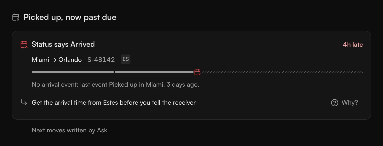
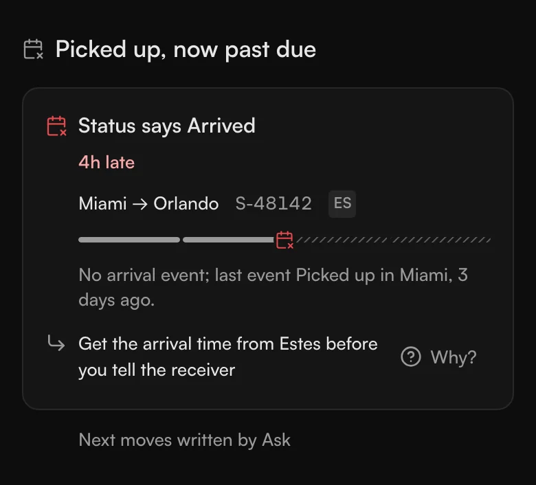
It never sends anything. You copy the draft and send it yourself, because people only send AI text after they've checked it.
Paying invoices
The pay review is on the invoices page. Invoices in freight have a lot of small things in them, like terms that say one thing and a hidden charge that says another, so the idea was that AI would scan them and tell you if something's wrong. A verdict like "AI reviewed 42 invoices, no errors found, 98 percent confidence" doesn't add up. Forty-two checked, nothing wrong, and only 98 percent sure? That's more of a design problem than a model problem.
So the page doesn't tell you how many it scanned. It shows what it checked and what it didn't. It checked delivery status, proof of delivery, extra-charge evidence and line totals. It didn't check payment terms or the booked rate, because every open invoice just reads Due with no value and there's no rate confirmation to compare against. Behind that, open invoices are grouped by what the records show, and the first group is orders that haven't been delivered yet. Why would you clear an invoice for an order you never got? That was an easy call.
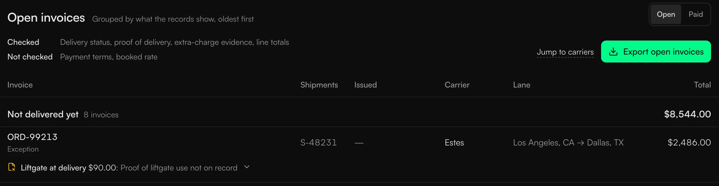
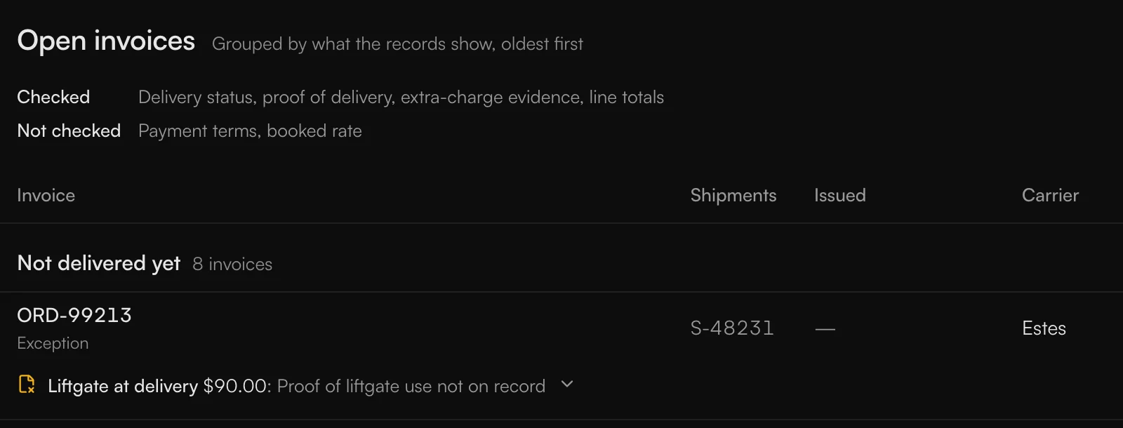
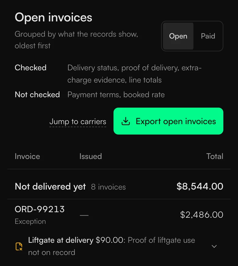
A flagged charge says what's missing, like proof the liftgate was used, and opening it shows what was billed, what was agreed and the evidence. It never says ready to pay. The screen shows the facts and the person decides. That's what you want in front of you when you're paying for something.
What changed in spend
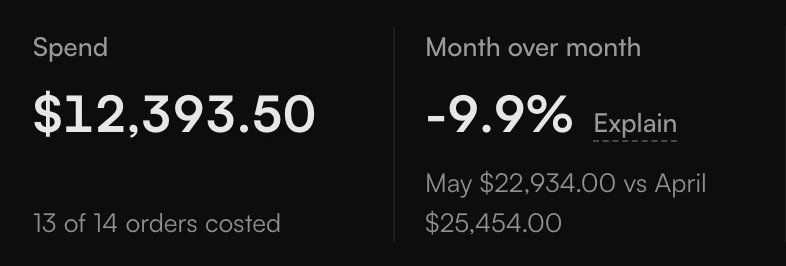
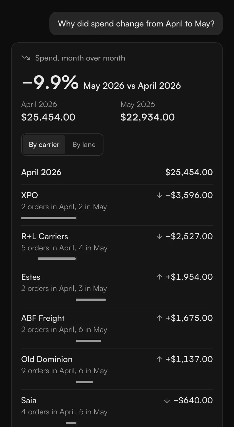
On the spend page there's a button next to the month-over-month figure that says Explain. It opens Ask beside the page with the question already asked. It's the same Ask, not a second assistant. You ask what changed in spend from one month to another and the data comes back straight away, not a paragraph about it.
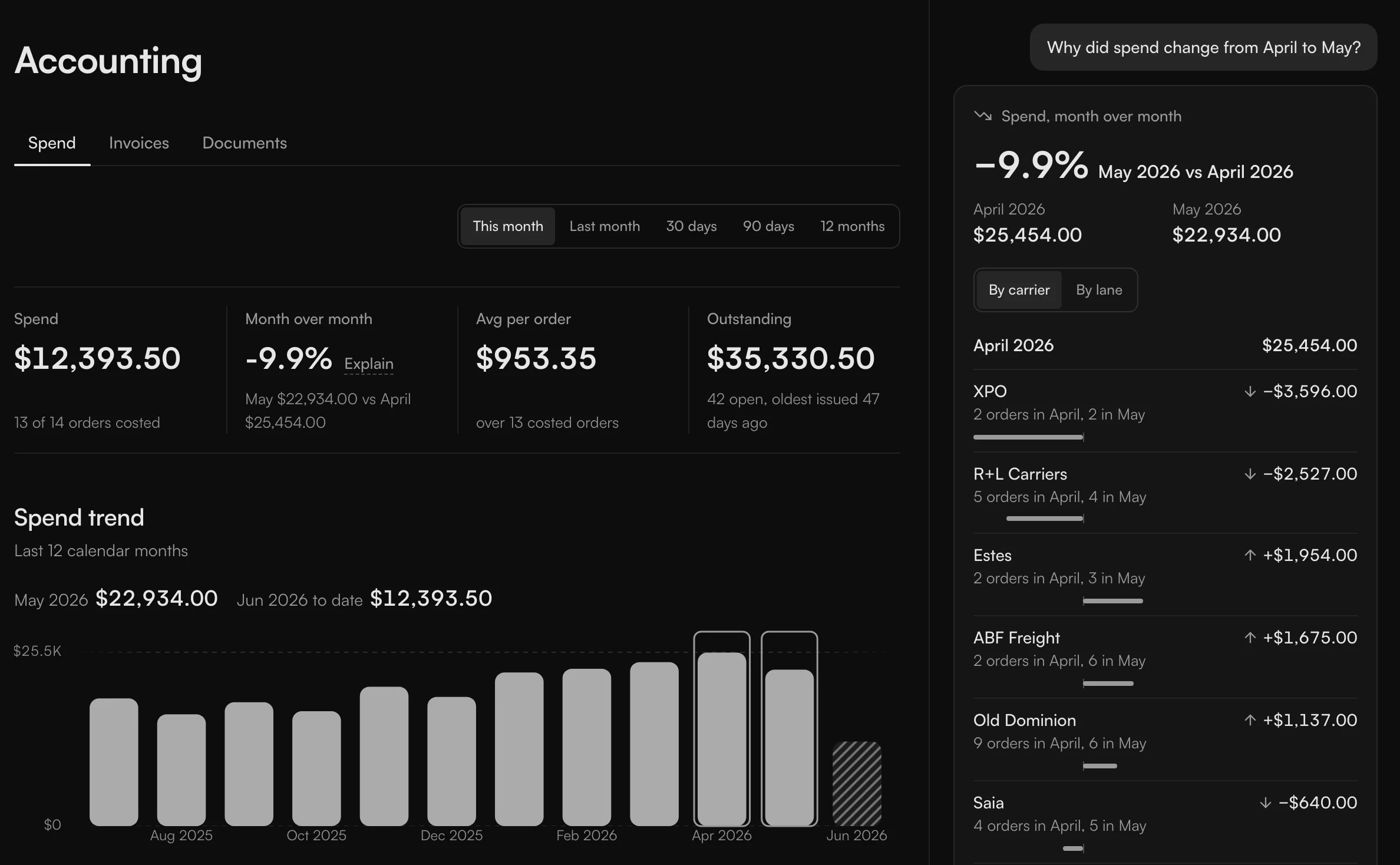

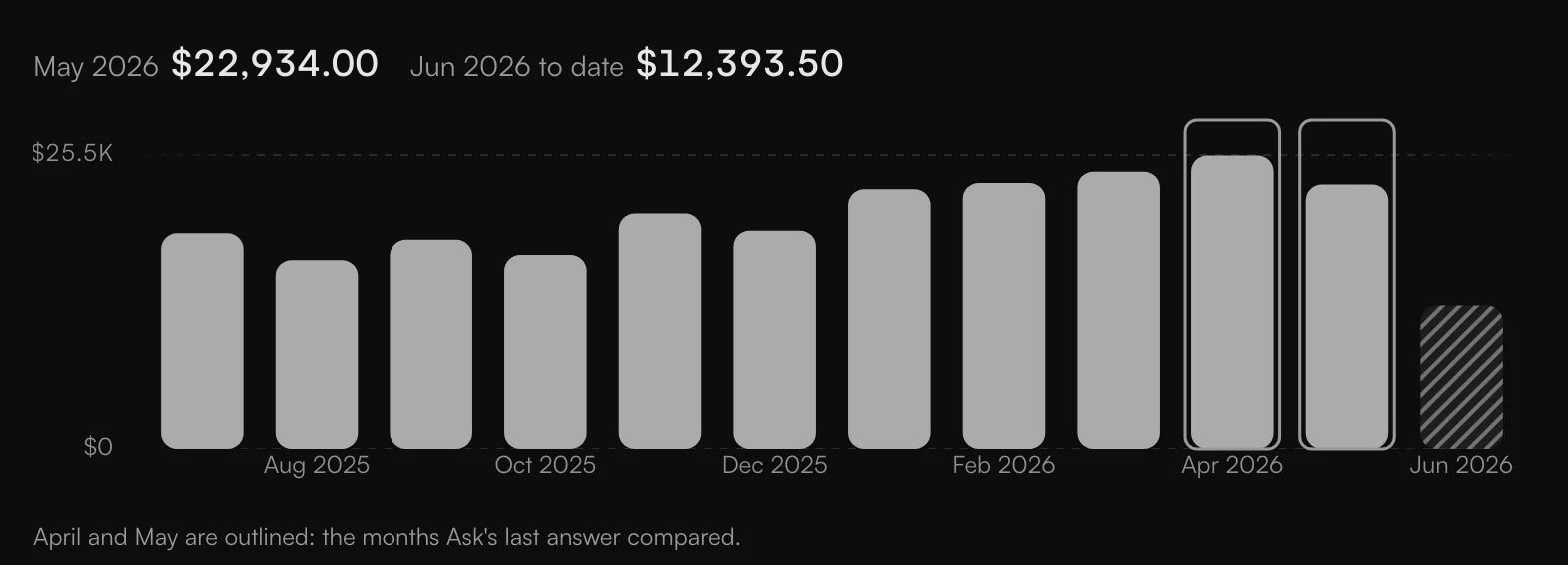
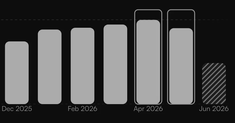
The answer is worked out from the records, carrier by carrier, from one month's total to the next. It names the two months it compared, so you know what the figure is measured against. Arrows show whether each carrier went up or down. There's no red or green, because spend going down isn't good or bad by itself. It can just mean fewer shipments. On the chart, the two months it compared are outlined.
It also doesn't say why spend changed. It shows what moved. My first rule for the biggest change named the wrong carrier, because carriers moved in opposite directions, so now it names the biggest drop and the biggest rise.
Ask
Ask is the chat. You open it from the top bar, or from the card, shipment or carrier you're looking at, and it opens beside the page, so the answer and the record are on screen together.
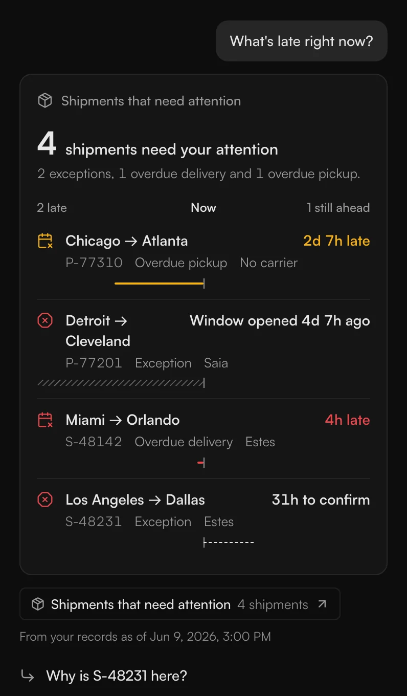
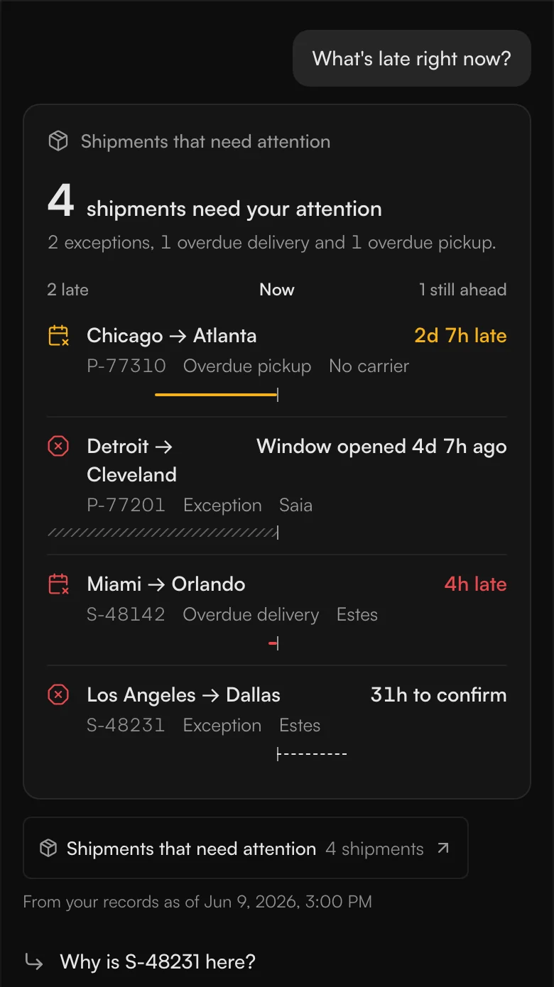
It doesn't answer in sentences. Ask what's late right now and you get the shipments themselves, each one a link to its page. That's on purpose. Writing the answer is where a language model goes wrong the most. It tends to give cheerful, exciting answers, and with a real shipment on the road, that can cost someone a lot of money. A chat is always limited, too. I eventually want to go where the data is, like brainstorming a design in chat and then going back to Figma. Rows let you act right where you're looking.
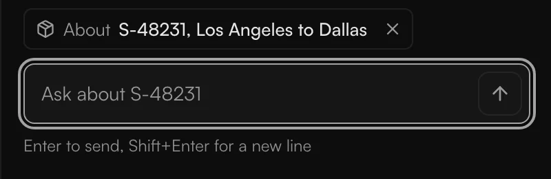
Every answer says when it was true. If it can't answer, it says so and lists what it can. Ask it to pay or send something and it says no. The only thing it will write for you is a shipment's update.
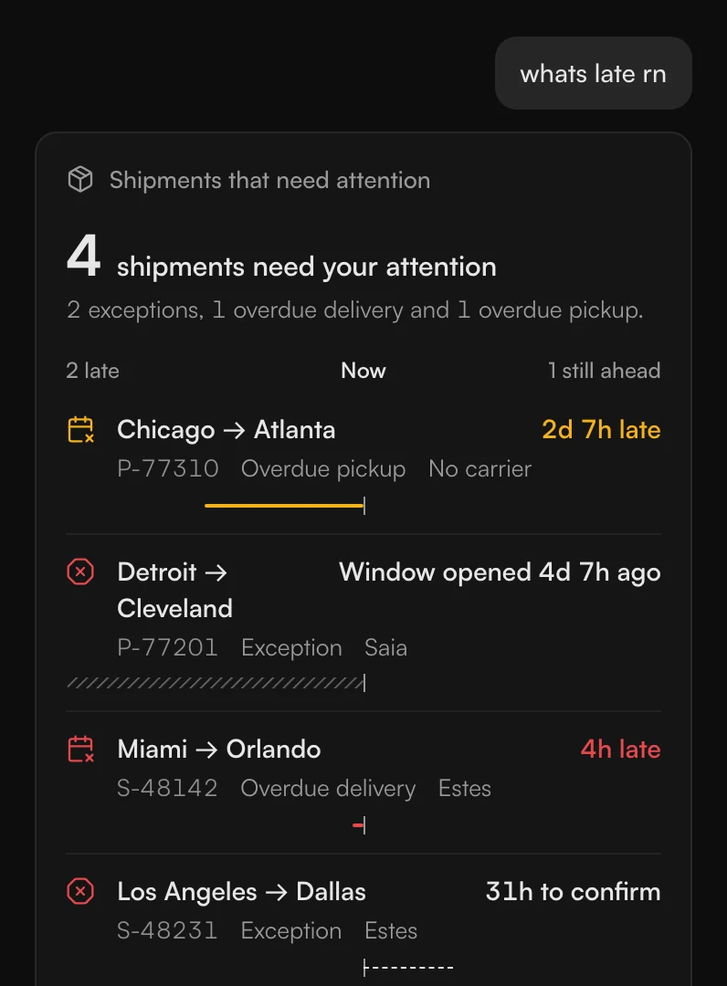
Typed the short way. 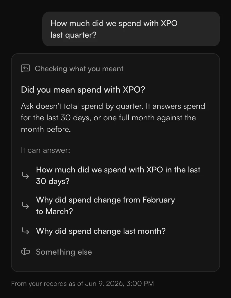
A near miss, asked back. 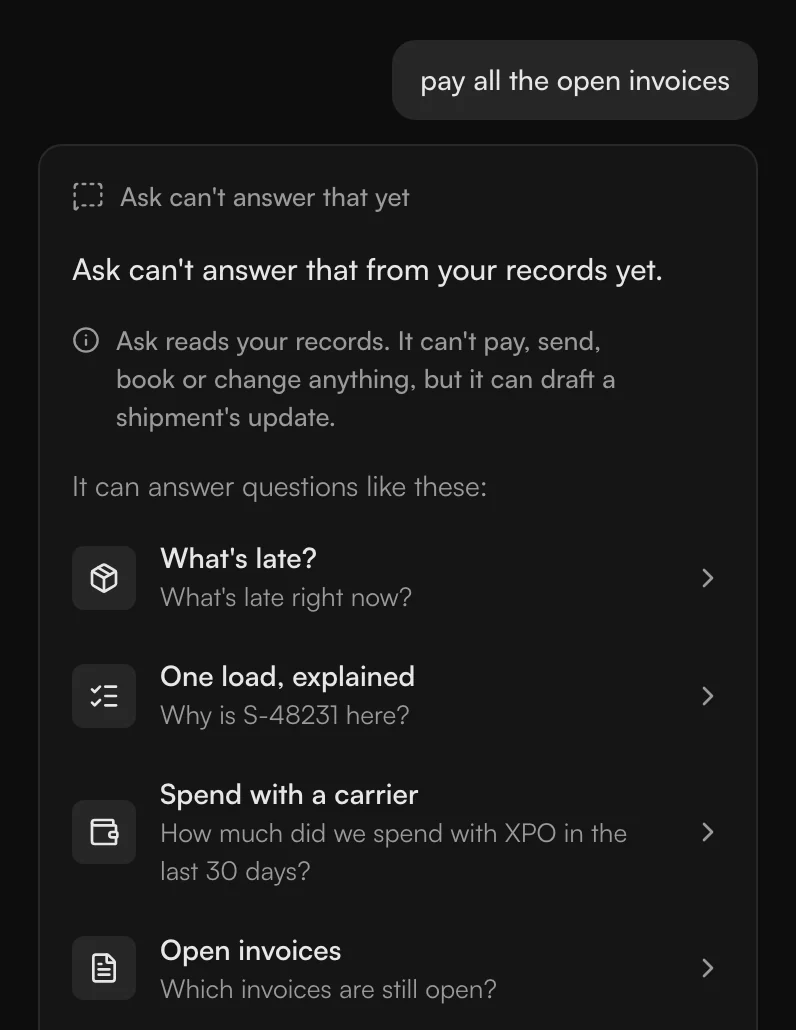
Asked to pay, it says no.
To test it, another AI that had never seen the code wrote 50 questions an operator might ask. The first version answered in sentences, and only 24 came back right. That's why it stopped answering in sentences. After that, 40 of 50 did.
I see it as a help and not something people have to rely on, a quality-of-life thing.
How it went
I counted orders and not logins. Logins show how many people signed up, not how many are using it. Counted that way, about 80 percent of shipment orders were coming in through the new TMS after two months. We released it in beta to about half of our existing customers, more than 1,100 companies, and it's in use.