Warp Tracking
A tracking page that tells you in one sentence where your shipment is
Where the shipment is
At Warp, when a shipment was booked, the person waiting on it got a tracking link. It could be the shipper or the shipper’s customer. Often it was the only part of Warp they saw.
In freight, people want to see where their shipment is and how it’s moving. Whoever opened that link should be able to tell right away.
The old page didn’t do that well. It was dressed like a terminal, and it wasn’t clear.
It was one of the smaller products I designed at Warp, alongside the Shopify app. A simple tracking page, but with a lot of little details in it.
The old page and the new one
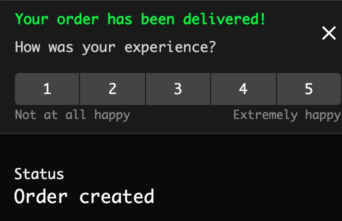
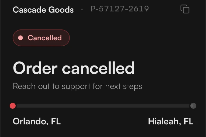
This is the same kind of order on both pages, one that was cancelled.
The old page was green type on black, in a terminal style. On this order it said "Your order has been delivered" and asked how your experience was, with a 1 to 5 rating under it.
The new page says the order was cancelled and tells you to reach out to support. It doesn’t ask for a rating, because nothing was delivered. The rating only shows on a delivered order.
One sentence
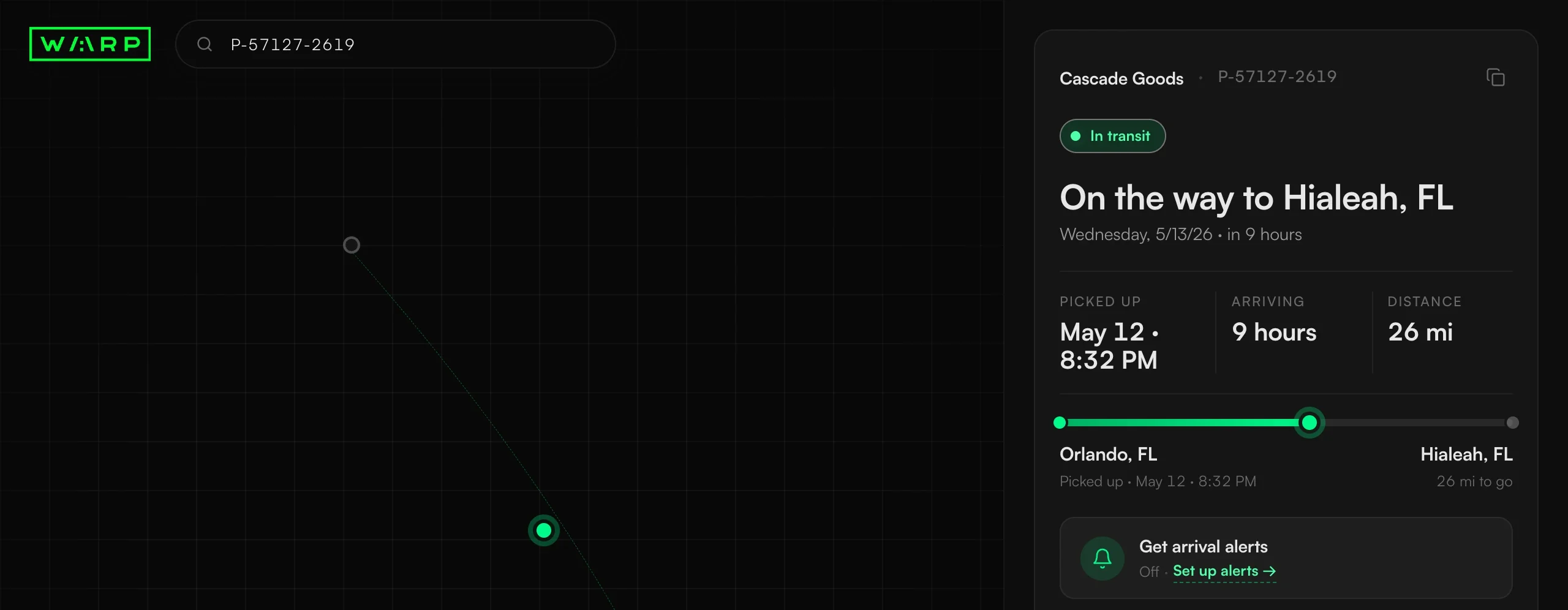
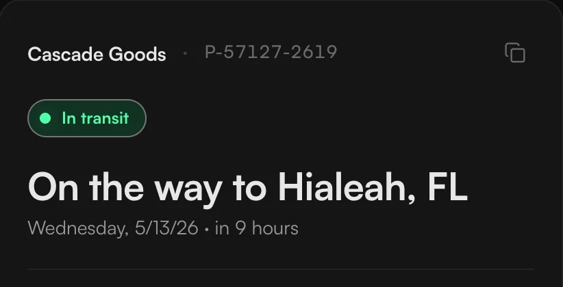
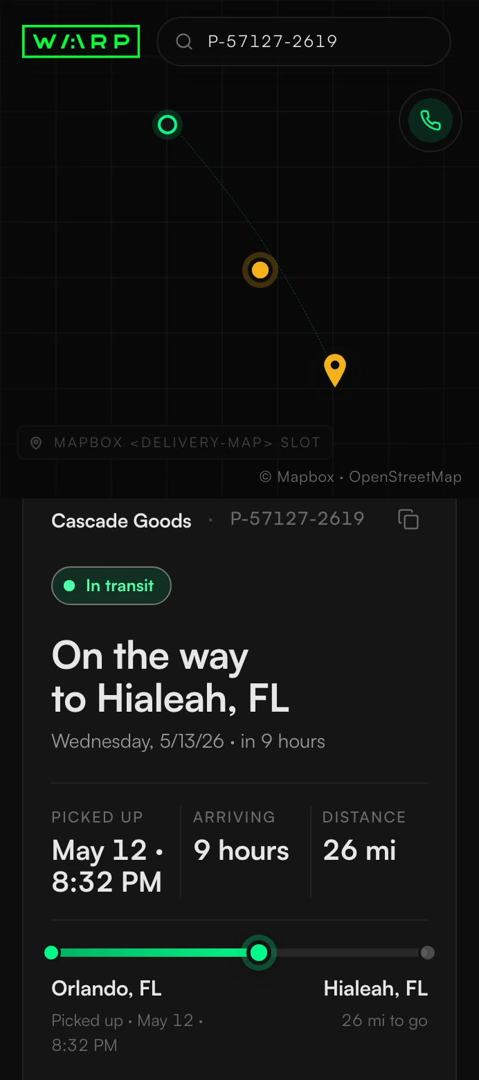
I wanted the page to say where a shipment is in one sentence. The moment you land on it, that line is the first thing you read. For a shipment on its way it says "On the way to Hialeah, FL", and once it’s there it says "Delivered to Hialeah, FL".
There’s one for every point in a shipment’s life, from a pickup that hasn’t happened yet to a return, a cancellation, or a delivery where some items were disposed of.
Warp’s own status label said In Transit even on a shipment that had come back or a pickup that failed. So the page doesn’t use it. It looks at what actually happened and writes the sentence from that.
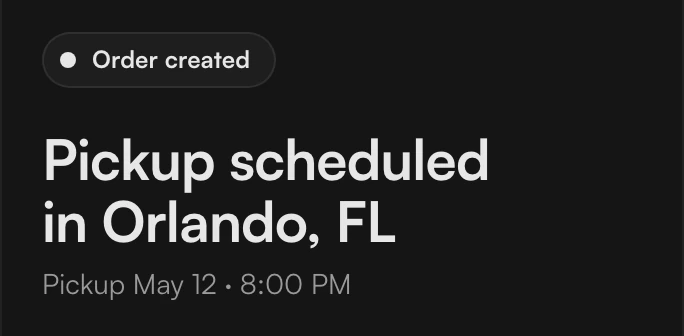
Pickup scheduled. 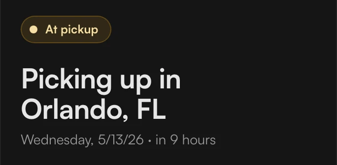
Picking up. 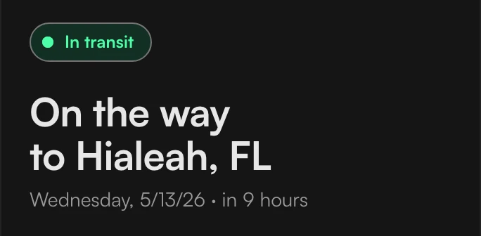
On the way. 
Arriving. 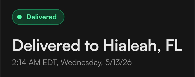
Delivered.
When it doesn’t go well
The page also has states for a pickup that failed, a shipment on its way back or already back, a cancelled order, and a delivery where some items were disposed of.
They use the same layout as the others, with the sentence at the top.
On a cancelled order, a failed pickup or a return, there’s a button to call support. On a cancelled order or a failed pickup there’s no row of figures, because there’s nothing to put in it.
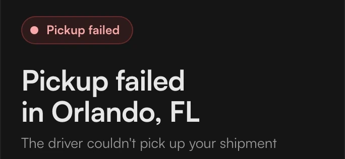
Pickup failed. The pickup didn’t happen. 
Returning. On its way back. 
Cancelled. Nothing was delivered. 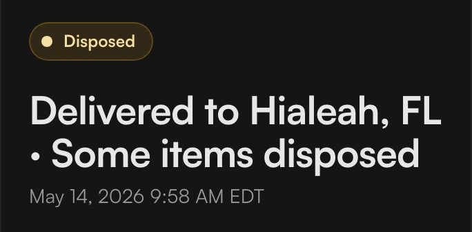
Disposed. Delivered, with some items disposed of.
Reading the card

- Header
- Status and sentence
- Figures
- Journey line
At the top of the card are the shipper’s name, the tracking number and a button that copies the tracking link. Under that is the status with the sentence below it, and the arrival day and time under that.
Under the sentence you get when it’s arriving, how far it has to go, and everything that’s happened so far, with the list already open.
The map in this prototype is a stand-in. Warp’s engineers already had their own map.
The alerts row took three tries
The page lets you ask for arrival alerts by text or email. The control for that took me three tries.
One, a toggle that opened a window.
First it was a toggle. It didn’t switch anything on. It opened a set-up window. The toggle said one thing and did another.
Two, a toggle with nothing behind it.
Then I made it switch on for real. There was no email or number behind it yet, though, so it said on with nothing to send to.
Three, the version that stayed.
The version that stayed has no toggle. Before anything is set up it says Off, with a link to set up alerts. Once you’ve told it where to send them, it says alerts are on and shows where they’re going.


The row before and after you save. 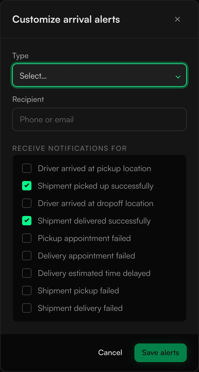
The set-up window.
The small movements
If I had to point at one thing on this page, it’s the small movements.
Copy the link and the icon turns into a tick for a moment.

Copying the link. The list of updates opens and closes smoothly, without a jump.
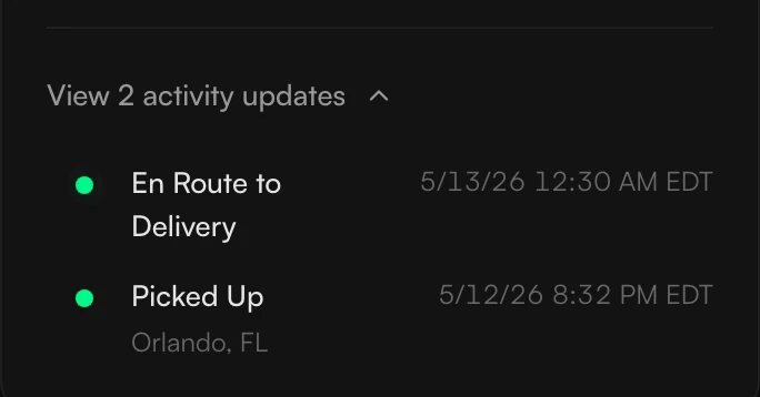
The update list. Press Track with nothing typed in and the field gives a little shake.
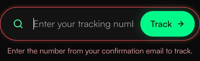
Pressing Track with nothing typed. Buttons dip slightly when you press them.
A button press. The green line from where the shipment started to where it is now fills in at a steady speed. A longer trip takes a little longer.
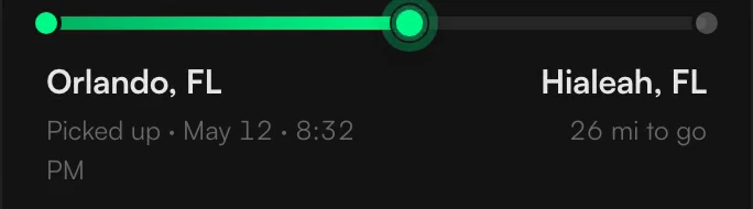
The line filling in. The pulsing ring on the status dot and the driver only shows while a shipment is moving. Once it’s delivered or cancelled, the dot stays still.
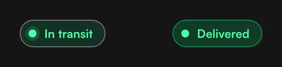
The ring only while it moves.
Handing it over
I designed the page and made a working prototype of it, and handed that to Warp’s engineers.